Everyone thinks about the size of the sofa and the color of the paint. But what about the moment you sit on that sofa and need to charge your laptop? Or the mood-setting lamp that has no place to plug in?

And if you look at the floor plan, you would think it’s a two dimensional thing.
It can’t be further from the truth. In fact, when I create a floor plan, I design the experience of the space.
A beautifully drafted floor plan is just a shell. The electrical plan is its operational core: the difference between a space that looks good and a space that actually works.
Waiting until construction to decide on placement is a recipe for design frustration and clunky workarounds.
Let’s look at why your layout design is incomplete without a power strategy.
Posh Chic Cool is a participant in the Amazon Services LLC Associates Program, an affiliate advertising program designed to provide a means for sites to earn advertising fees by advertising and linking to Amazon.com. As an Amazon Associate, I earn from qualifying purchases at no extra cost to you. Disclaimer, Privacy Policy and Terms and Conditions
The Trap of the Unplanned Space
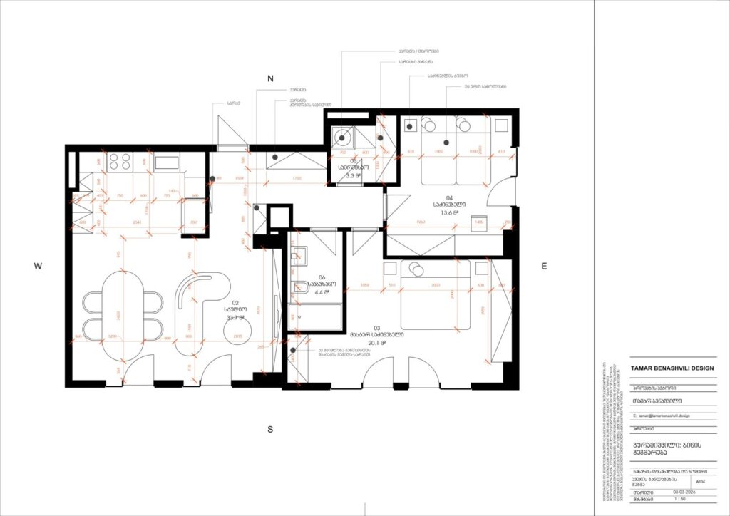
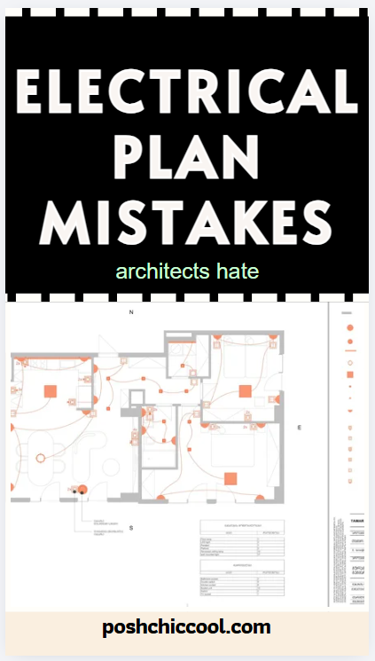
This is the project I did a week ago.
On its own, this floor plan is beautiful. It shows flow, furniture placement, room dimensions, and key architectural elements. It looks complete. But is it?
Imagine the master suite (03) here. Where’s the reading lamp switch?
Where is the light source for the living area? You might have beautiful ceiling lights planned, but a single wall sconces would create a warm, layered look. Where’s the outlet?
Or maybe we could put a floor lamp at the end of the sofa? right next to the balcony door?
Where could we put the socket? What if you want to plug your laptop while working form the cough? Maybe we would beed 2x sockets in the floor next to the couch?
I see so many floor plans showcasing lighting layouts without a plan for where the fixture plugs in. What we get in the end? A cord draped across the carpet in a beautiful, open-concept living area
That’t why a furniture plan even with the lighting plan is incomplete without showing the outlet positions.
Now, look at the other side of the design equation. This is what makes a floor plan complete. Every experiential detail has a pre-thought solution.
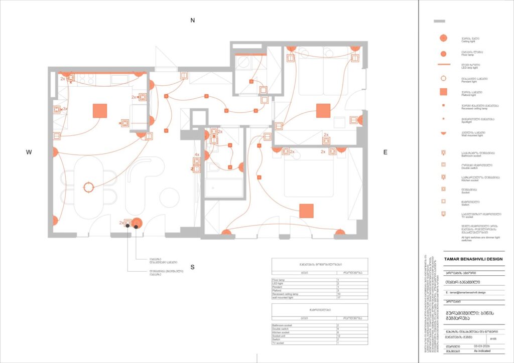
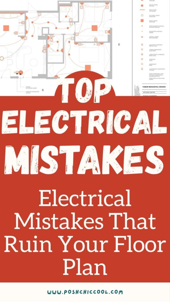
What you see here is a lighting plan with outlets. lines connect the outlets with the light fixtures.
Sometimes two outlets are connected to the same lighting fixture. This is not random. This is pre-planned experience of the space.
Let’s say, you came home and turned on the lights in the hallway. Then, after a while, you went to the bedroom to sleep. The light can be turned off (and on) from the switch at the bedroom door. So you don’t have to walk in the dark.
Again, the scenario we already described above: the couch and outlets nearby: as you see, on the lighting plan, we included 2x power outlets – one for the floor lamp and one for laptop charger.
Here are some common sense rules to help you plan your electrical layout
1.Floor Sockets are Freedom
we love the breathability of a large, open-concept “Great Room.” However, these expansive layouts often create a “power desert” in the center of the space. When your sofa or reading chair is floating away from the walls, how do you power a reading lamp or charge a device without a hazardous cord draped across the rug?
The answer is always Intentional Floor Integration!
As I develop a floor plan, my priority is creating a layered lighting scheme.
To achieve that warm, high-end glow, you need more than just overhead recessed lights: you need lamps on side tables and consoles, floor lamps next to the reading chair or a sofa etc.
By integrating strategic floor outlets directly beneath your furniture placement, we provide power exactly where it’s needed while keeping the aesthetic completely clean.
This is the primary reason why an electrical plan must be finalized alongside the architectural layout.
These floor boxes aren’t an afterthought; they often need to be integrated into the subfloor structure long before the final finishes are even selected.
Waiting until the walls are up is too late. By planning early, we ensure your home remains as functional as it is beautiful, with “trip hazards” and “cord chaos” designed out of the equation entirely.
2. Invisible Design and Hardware ‘Jewelry’
When it comes to the final aesthetic of your electrical plan, I typically guide my clients toward one of two distinct design philosophies: Invisible Integration or the Integrated Accessory.
Neither is “better,” but the choice must be intentional to ensure the power outlets don’t compete with your architecture.
The Invisible Integration
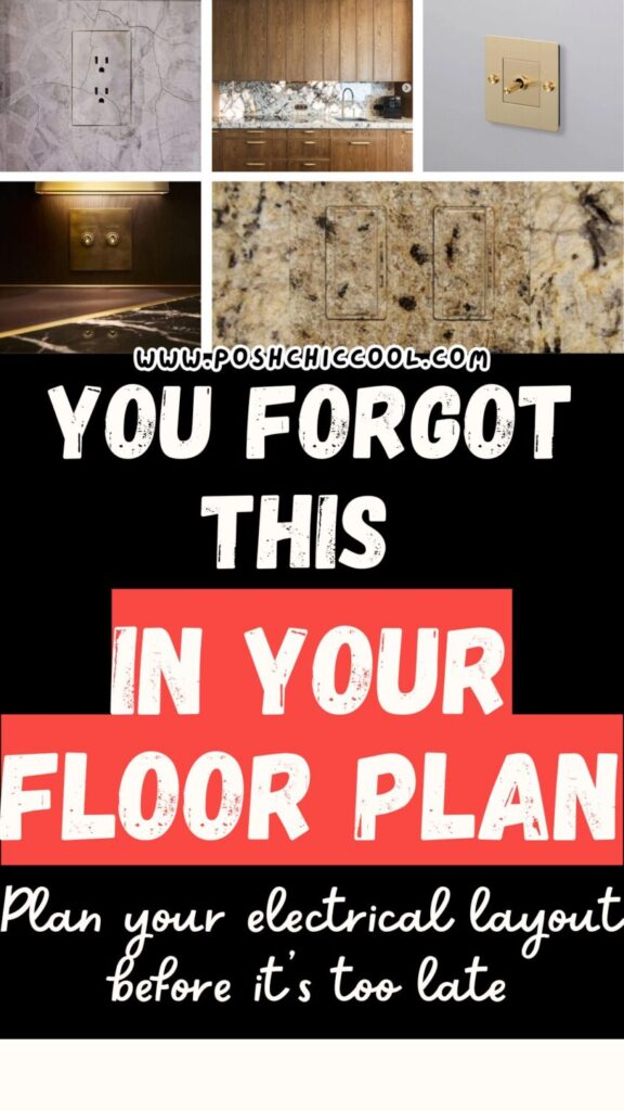
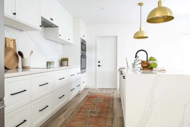
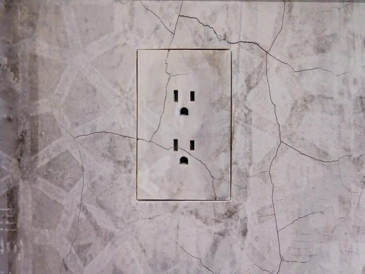
For high-impact surfaces like a book-matched stone backsplash or custom millwork, the goal is for the technology to vanish. We want the beauty of the material to be the focal point, not a plastic receptacle.
To achieve this, I specify flush-mount systems like the Bocci 22 System or TRUFIG. These aren’t just covers; they are architectural components that sit perfectly flush with the surface.

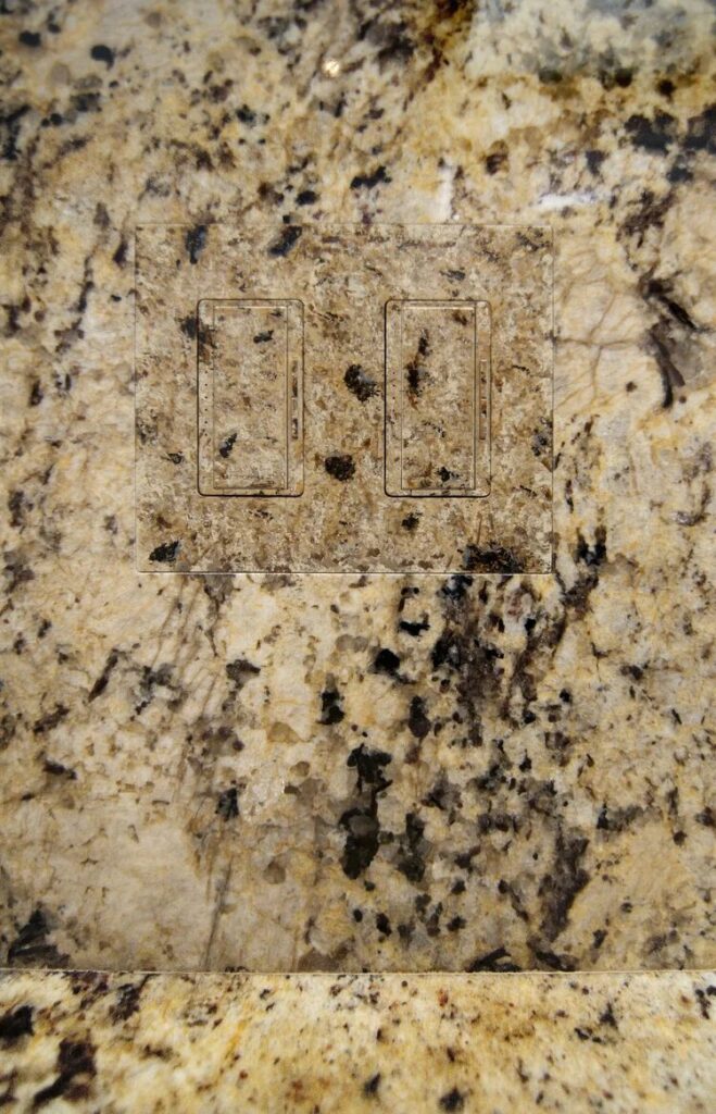



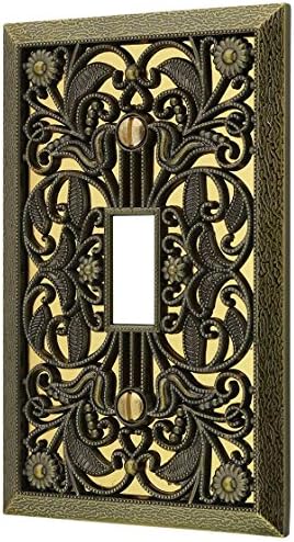

By using a paintable fascia or a custom-matched insert, we can “camoflauge” the outlet to match the exact veining of the stone or the hue of the cabinetry. It transforms an eyesore into a detail that truly disappears.
The Integrated Accessory
If we can’t hide the outlet, we celebrate it. In this approach, we treat the outlet plate like a piece of high-end hardware—similar to your cabinet pulls or plumbing fixtures.
I often turn to brands like Forbes & Lomax or Buster + Punch for their solid metal finishes. A hand-finished Antique Bronze or Smoked Bronze plate adds a layer of tactile luxury to a kitchen.
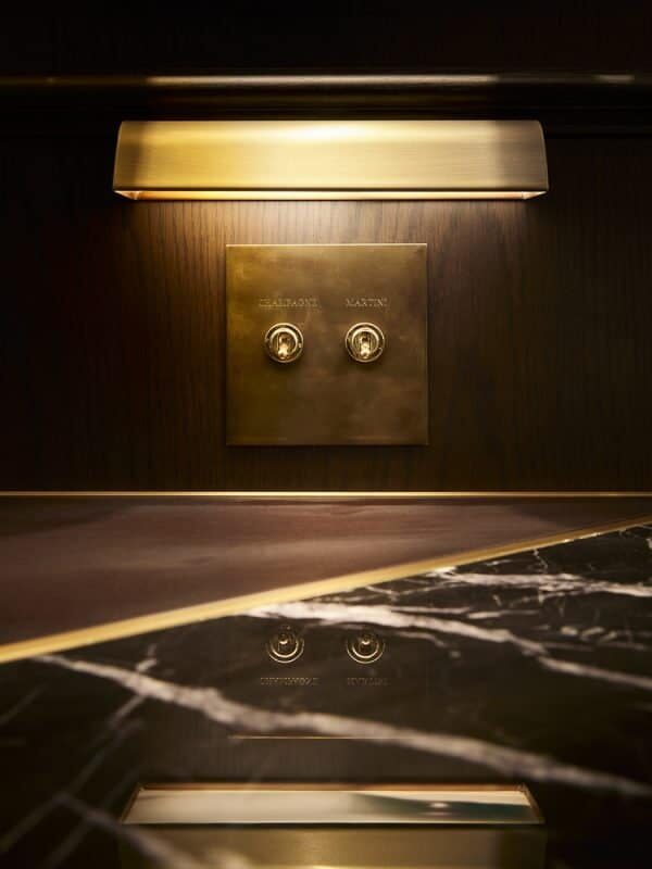
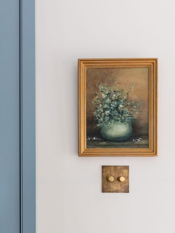
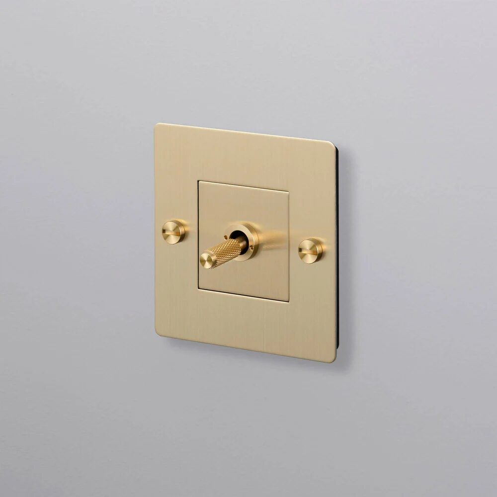
The best part about Buster and Punch is that they also sell all types of other hardwares (including door handles, cabinet handles, spotlights etc). So if you shop all your hardware, including sockets and switches, the whole space will have a cohesive designer-planned look.
A great way to integrate power outlets is to place them on the toe kick and match the finishes.
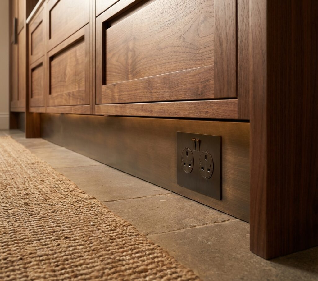
By placing a coordinated bronze outlet in the plinth of a kitchen island, we can provide essential power for a vacuum or phone charger without breaking the visual line of the cabinetry.
Voila! It turns a utility into a deliberate design choice.
3. Placement is Performance
the placement of an outlet is just as critical as its finish. It’s about visual ergonomics—ensuring the power is exactly where the user needs it without the outlet itself becoming a focal point of the wall.
The “Low and Discreet” Standard
For standard living areas, bedrooms, and hallways, my general rule of thumb is to specify electrical outlets as low to the floor as possible.
By dropping the height of the receptacles (often to just above the baseboard), we significantly reduce visual noise and keep the “eye level” of the room clean.
This is particularly effective in spaces where you want the architecture or a specific wall treatment to stand out. It ensures that even if a cord is plugged in, it remains tucked away and less intrusive to the overall flow of the room.
The exception is if we use the outlets as part of the design concept, i.e. the “jewelry” and the products we choose should live up to that expectation.
However, in high-performance areas like a kitchen, the “low and discreet” rule is traded for strategic integration.
The kitchen backsplash and island require a different level of precision.
Precision Coordination: In these zones, outlet placement must be meticulously coordinated with cabinet heights, stone veining, and tile patterns.
The Legend as a Guide on my electrical plan above: If you look at the Legend on the right side of Image, you’ll see specific symbols for 2x and 4x socket types. These aren’t just quantities; they represent specialized, moisture-rated, or high-capacity units designed for heavy appliance use in the kitchen.
In these cases, we recommend using integrated systems—like pop-ups for islands or under-cabinet strips for backsplashes. This allows the beauty of your chosen materials (like the stone mentioned earlier) to remain uninterrupted.
If this is not approved by the client, we then specify products that ensure maximum visual integration with the materials around it.
TRUFIG that I mendioned above, is a great example.
Your Home Deserves a Completed Blueprint
At the end of the day, a floor plan isn’t just a drawing of walls and windows—it is a map of how you will move, work, and relax within your home. And in a modern home, life requires power.
If you view your floor plan as a finished product before the electrical and lighting layers are integrated, you are building a beautiful, but fundamentally incomplete, shell. You’re leaving the most important part of your daily experience—how you see and interact with your space—to chance.
True luxury in interior design isn’t found in the most expensive sofa; it’s found in the absence of friction. It’s the bronze toe-kick outlet that’s exactly where you need it, or the stone backsplash that remains a flawless, uninterrupted masterpiece because the power was “designed away” into the architecture itself.
This level of seamless, intentional integration is what turns a house into a high-performance home. It’s the difference between a project that looks good on paper and a space that feels effortless to live in.
Don’t settle for a “half-finished” plan.
Your investment deserves more than a layout; it deserves a perfected blueprint for living. Let’s make sure your next project is a masterpiece of coordinated, integrated design—from the first light switch to the last toe-kick outlet.