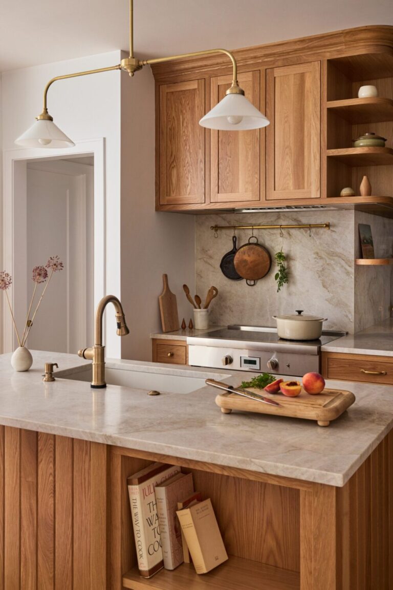
What is the best color combination for a bedroom?
Choosing the best Bedroom Color Combination is less about following rules and more about creating a space that feels deeply restful the moment you step inside.
Your bedroom is where you unwind, reconnect with yourself, and start and end every day, so the colors you choose should support that sense of calm.
Designers often turn to color-theory-based palettes because they create harmony instantly.
From analogous Bedroom Colour Ideas to bold complementary contrasts, each type of color scheme offers its own mood and energy.
Some combinations, like layered neutrals or tonal palettes, evoke a calm spa-like feel – perfect for an Earthy Bedroom.
Others, like rich blues paired with warm neutrals, bring depth and sophistication to Master bedroom color palette ideas or Bedroom color schemes for couples.
Analogous color combinations for the bedroom
Analogous color combinations are palettes built from colors that sit next to each other on the color wheel – think soft blues blending into blue-greens, or warm taupe shifting into muted terracotta and clay.
Because these hues share similar undertones, they naturally feel cohesive, soothing, and effortless, which is why designers often use them for creating calm and balanced Bedroom Color Schemes.
In bedroom design, analogous combinations work beautifully when you want a space that feels harmonious and grounded without relying on a single monotone hue.
This strategy is great if you prefer warmth or coolness in a subtle gradient. For example, a Taupe Bedroom flowing into warm beige and soft clay; or a Blue Bedroom layered with blue-grey and muted teal.
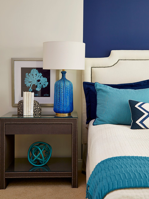
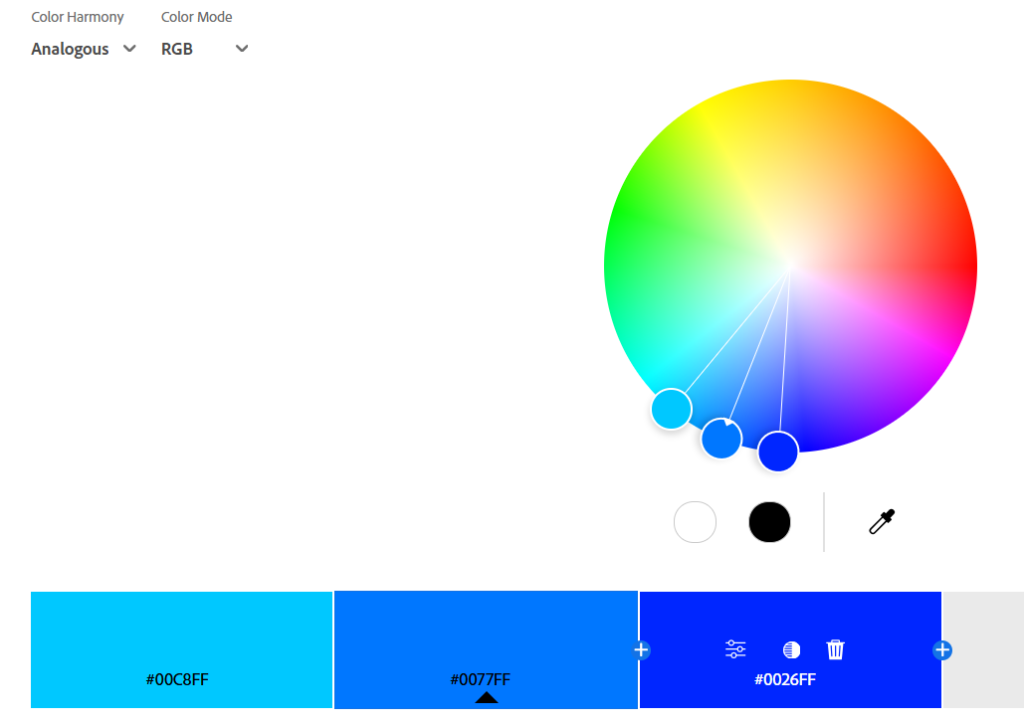
However, be careful: make sure to use enough contrast. If all the colors are too similar, the space may fall flat.
Adding a grounding neutral – like a deep chocolate, charcoal, or creamy off-white – keeps the palette dimensional.
Monochromatic color combinations for the bedroom
Monochromatic color combinations are built from a single base color, expanded through its tints, tones, and shades.

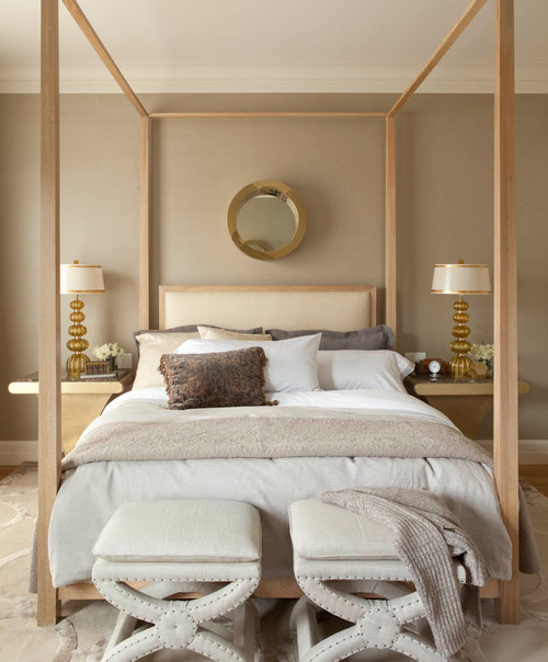
Think of a Taupe Bedroom layered with warm beige, soft mushroom, and deep cocoa, or a Blue Bedroom that moves from powder blue to slate to midnight.
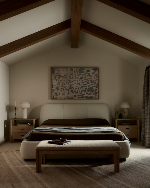
Because everything stems from one hue, these palettes feel naturally cohesive, calm, and visually seamless.
In bedroom design, monochromatic schemes are very popular for creating tranquil, high-end spaces.
They’re ideal for Calming Bedroom Colors, Cozy Bedroom Color Palette Ideas, and minimal, spa-inspired interiors where the goal is to reduce visual noise.
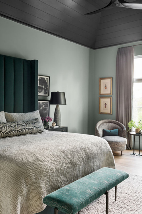
When done well, they create a serene, cocoon-like atmosphere that feels intentional and deeply restful.
Use them when:
- You want a soothing, understated space. Monochromatic palettes are perfect for restful, low-stimulation environments.
- The architecture or materials are already strong. This palette lets textures shine – wood grain, linen, stone, or plaster become the “contrast.”
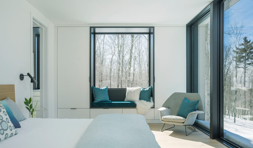
- You prefer subtlety over boldness. It’s a refined option for Master bedroom color palette ideas and Bedroom color schemes for couples who want simplicity that still feels elevated.
- You love a polished, boutique-hotel aesthetic. Color-drenching a bedroom in tonal hues creates a quiet luxury feel.
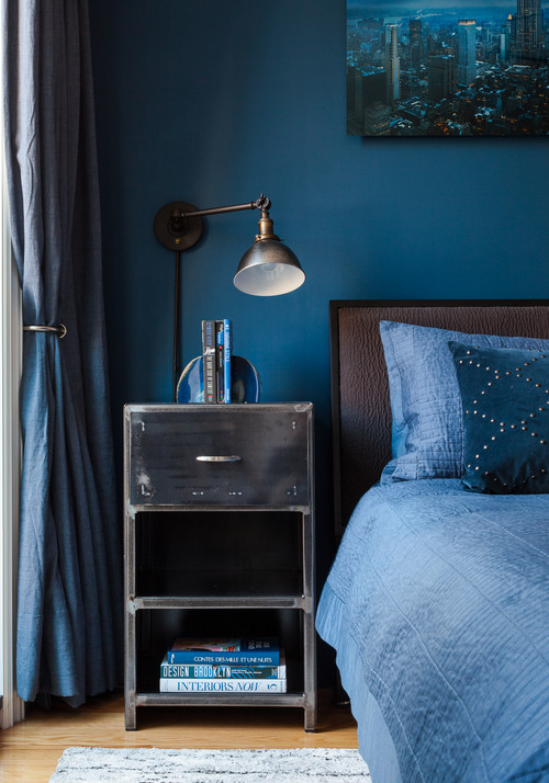
However, you should be careful about:
- Lack of depth. A single-color space can feel too plain if everything is the same tone. Introduce variety through darker shades, airy tints, and a mix of matte and textured finishes.
- Ignoring undertones. If your base color has a cool undertone and the supporting tones skew warm, the harmony breaks. Stick to tones that clearly belong to the same color family.
- Overdoing dark colors in low-light rooms. A deep, moody monochrome palette can be gorgeous, but in a north-facing or small bedroom, it may feel heavy unless balanced with soft lighting.
- Insufficient texture. Monochromatic bedrooms rely heavily on tactile variety: linen bedding, wool throws, textured walls, natural wood, or stone accents.
Triad color combinations for the bedroom
Triad color combinations are built from three colors that sit evenly spaced around the color wheel.
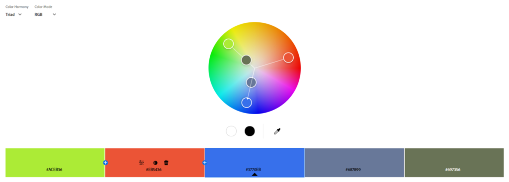
Think of pairings like blue–rose–mustard, or sage–terracotta–dusty lavender.
It’s not necessary to use all three colors from the triad scheme. You can use two, and the color scheme will still be triad.
Because each hue comes from a different segment of the color wheel, triad palettes naturally feel balanced yet dynamic, offering more visual interest than analogous or monochromatic schemes while still maintaining harmony.
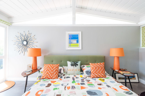
While triad combinations are less common in bedrooms than calmer palettes, they absolutely have a place in thoughtful Bedroom Color Schemes, especially, in darker, moodier vibes.
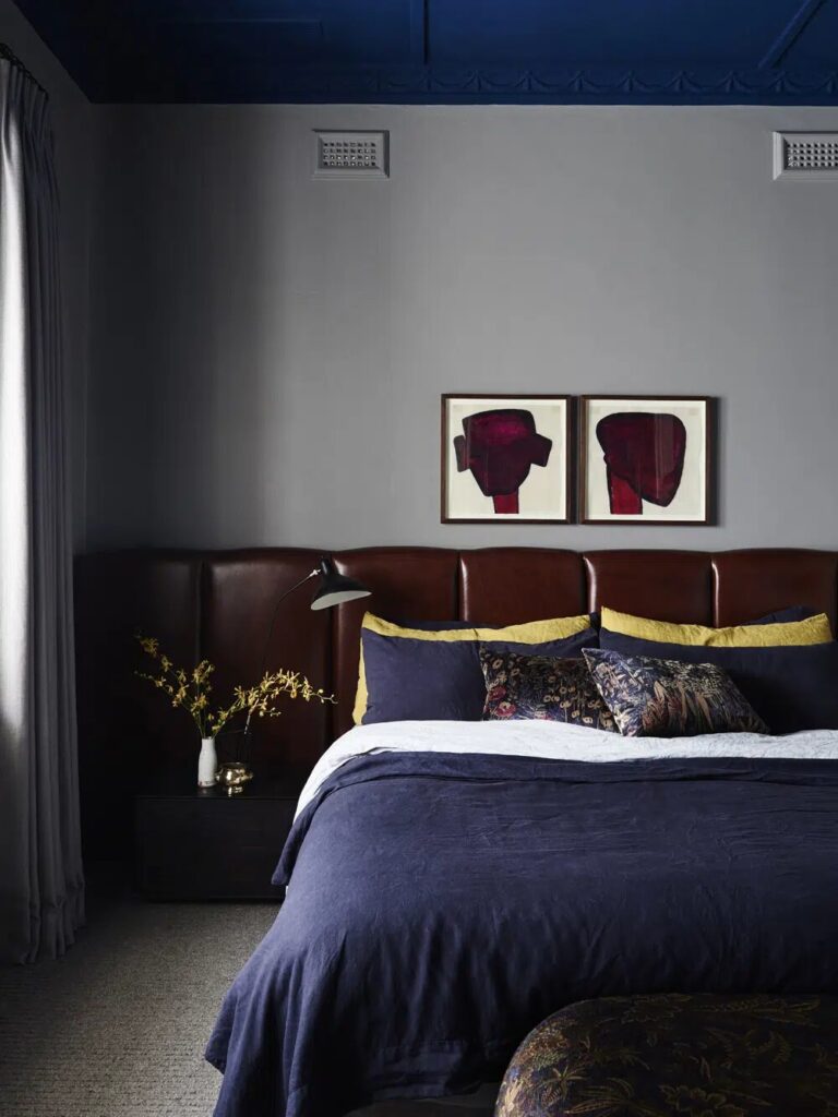
When applied with softer, muted tones, triads can create warm, expressive spaces that still feel relaxing.
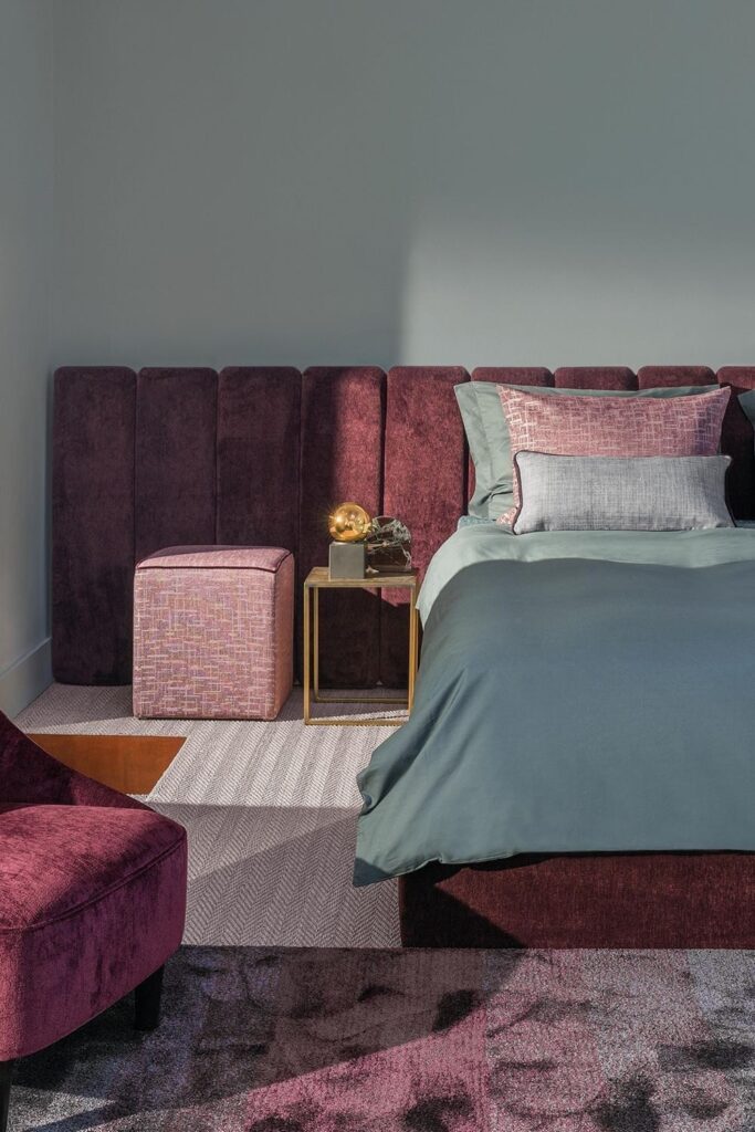
Designers often use them to bring personality into Bedroom Inspirations, especially when a room needs a gentle boost of color without leaning bold or chaotic.
Avoid using all three colors at full saturation. Choose softer, dustier, or earthier versions to maintain a calming bedroom mood.
Pick a dominant hue. Let one color guide the palette, usually the wall color, while the other two support through accents or textiles.
Watch your proportions. A 60–30–10 rule (dominant, secondary, accent) works beautifully for triads.
Stay aware of undertones. Even when colors are far apart on the wheel, undertones still need to harmonize – warm with warm, cool with cool.
Don’t forget neutrals. A grounding taupe, warm white, or soft charcoal keeps the palette sophisticated and prevents sensory overload.
Complementary color combinations for the bedroom
By far, this is my favorite way to combine colors.
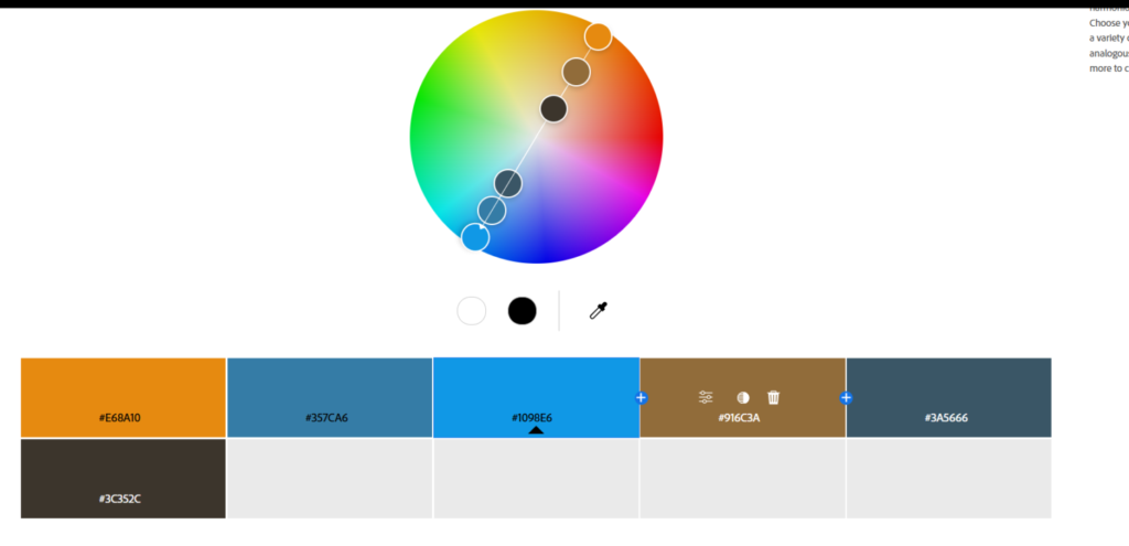
Complementary color combinations pair two hues that sit directly opposite each other on the color wheel: think blue and yellow, sage green and vintage grape, or dusty lavender and tea green.
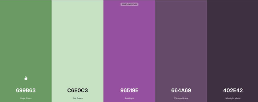
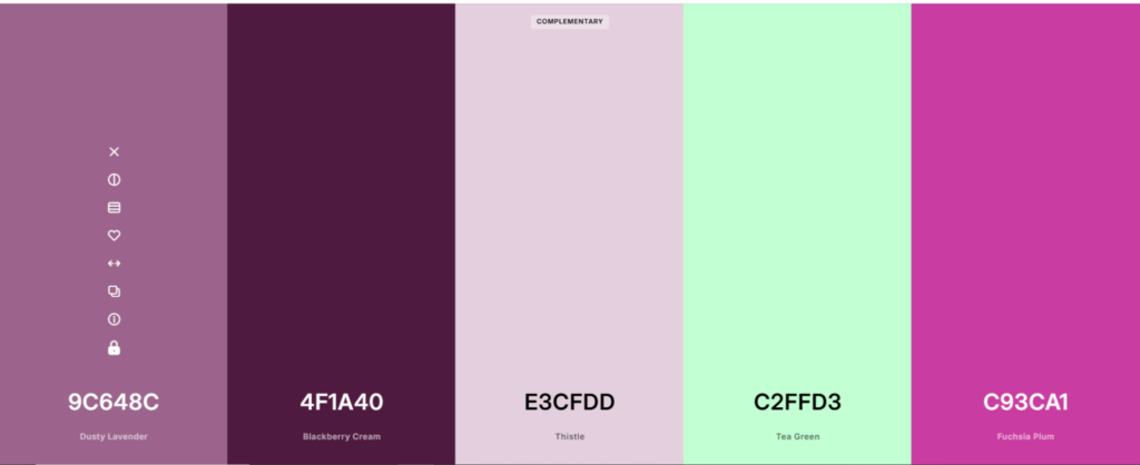
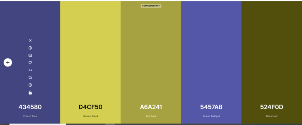
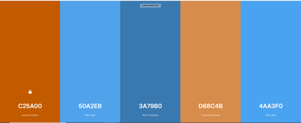
Because these colors contrast naturally, complementary palettes feel dynamic and balanced at the same time.
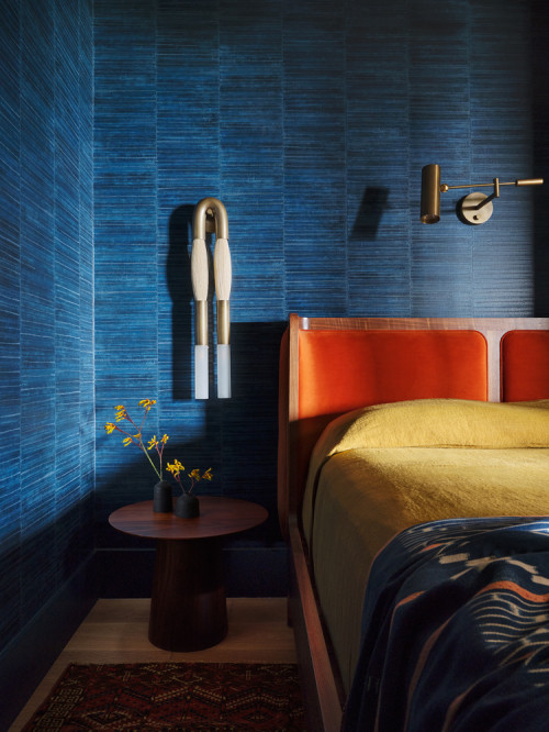
When softened into more muted, dusty tones, they create beautiful Bedroom Color Schemes that feel both stylish and soothing. Think of burgundy and dark green, just like on the 6th image in the IG post below ↓.
Although people often associate complementary colors with bold, high-energy designs, they’re also used in bedrooms when applied thoughtfully.
Designers love these pairings because they introduce just the right amount of visual interest: perfect for bedrooms that need warmth, dimension, or a subtle sense of personality.
Complementary colors are powerful, so they require a bit of restraint to keep the space restful:
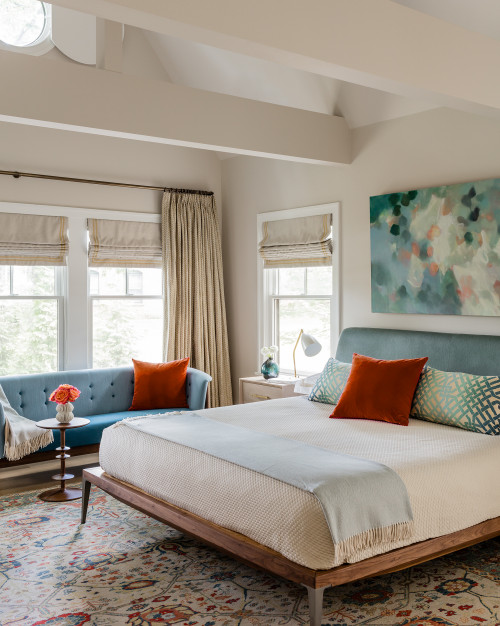
- Avoid using both hues at full saturation. Bright orange and bold blue are too stimulating for a calming bedroom. Opt for dusty, earthy, or toned-down versions.
- Let one color lead. Make one your primary hue (often the wall color) and the opposite your accent. A 70–30 or 60–40 proportion works well.
- Balance with neutrals. Complementary palettes always benefit from a grounding shade: taupe, warm white, greige, or charcoal to keep the look elevated.
- Be mindful of undertones. If the cool color leans slightly warm or vice versa, the harmony can break. Stick to undertones that genuinely pair well.
- Consider mood. Too much contrast can feel energizing rather than restful. Keep the palette soft.
Split complementary color combinations for the bedroom
Split complementary color combinations are a softer, more flexible version of traditional complementary palettes.
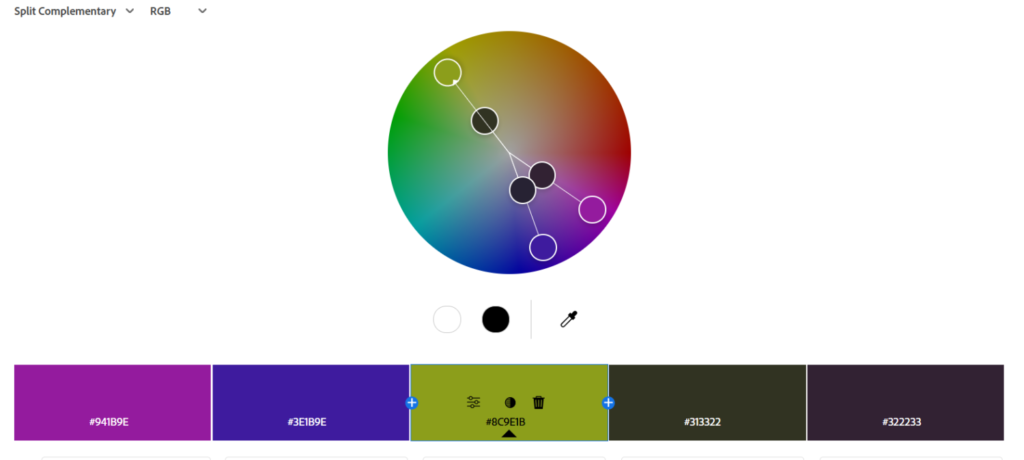
Instead of pairing one color with its direct opposite on the color wheel, you pair it with the two hues on either side of its opposite. For example:
- blue paired with rusty spice and dusty taupe
- sage green paired with vintage lavender and crimson violet
- taupe paired with pine teal and Graphite
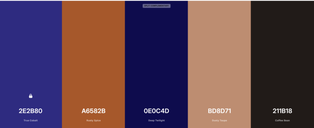
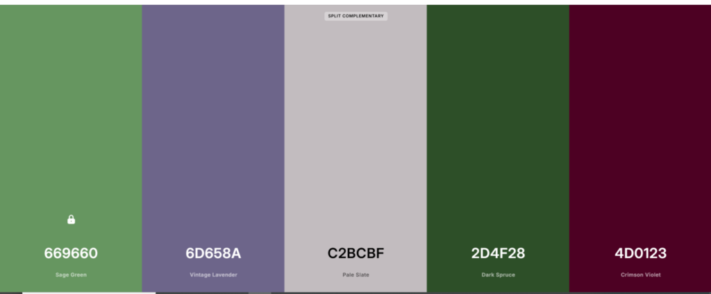
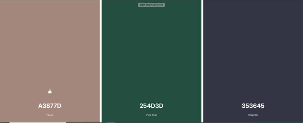
This approach creates contrast, but with a gentler, more nuanced feel – perfect for bedrooms where you want interest without intensity.
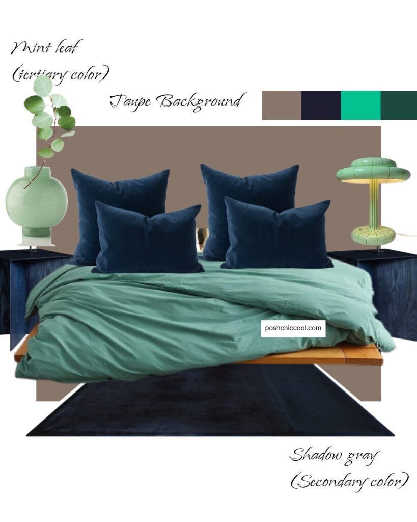
Because the colors aren’t strict opposites, split complementary schemes feel more balanced and livable, making them a smart option for Bedroom Color Schemes that need personality while still feeling calming.
Don’t use all three colors at equal intensity. Let one hue lead the palette (often the wall color), and use the other two in softer doses: bedding, artwork, or accent furniture.
Choose muted, desaturated versions. Dusty rose, foggy blue, clay, olive, stone. These tones maintain a calming bedroom atmosphere.
Avoid high contrast in low-light rooms. If your bedroom is north-facing, bold contrasts can feel harsh. Keep transitions smooth.
Watch your undertones. Warm accents and cool anchors must still share complementary undertones (warm-with-warm, cool-with-cool).
Don’t clutter the palette with too many extras. Since you’re already working with three main hues, keep additional colors to a minimum.
Square color combinations for the bedroom
Square color combinations use four colors that are evenly spaced around the color wheel, creating a balanced yet lively palette.

Unlike triads (which use three colors) or analogous schemes (which group similar hues), square palettes pull from four distinct sections of the wheel.
This means you get a mix of warm and cool tones, light and dark notes, and plenty of visual contrast.
For example, a softened square palette might include:
- lemon lime
- blue violet
- turquoise
- spicy paprika

When these colors are toned down into more earthy, desaturated versions, they can create a beautifully layered, expressive bedroom – full of personality but still cohesive.
square color combinations are used in bedroom design, but selectively. Because square palettes include four different hues, they’re less common in minimal or calming bedrooms. They are energetic and vibrant, more suitable for flamboyant spaces.
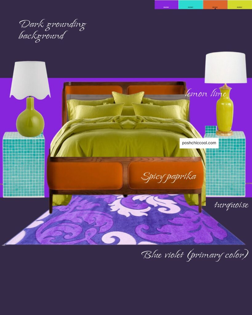
Designers use them when a space needs richness, depth, or a curated, eclectic vibe. When handled with restraint, square combinations can absolutely work in Bedroom Color Schemes, especially in boho, vintage-inspired, or modern eclectic interiors.
Compound color combinations for the bedroom
Compound color combinations, sometimes called complex complementary palettes, blend the principles of complementary and analogous color schemes.
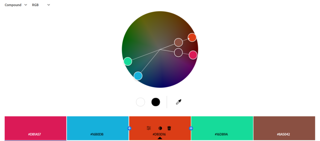
Instead of pairing just two opposing hues, a compound palette uses one main color and mixes it with colors adjacent to its complementary hue. For example:
- muted sage paired with terracotta, clay, and warm beige
- deep navy paired with soft coral, peach, and sand
- dusty lavender paired with olive, moss, and taupe
This approach creates contrast, but in a far softer, more sophisticated way than a strict complementary pair.
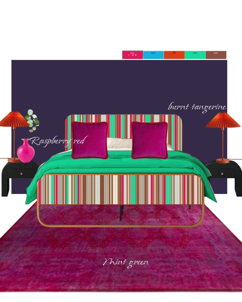
The result is a layered, nuanced palette that feels intentional, warm, and incredibly inviting.
Because compound palettes balance harmony and gentle contrast, they’re absolutely used in Bedroom Color Schemes, especially in rooms where you want depth without boldness. Designers love them for bedrooms because they keep the space calming, yet visually interesting.
compound color combinations are used in bedroom design, though many people don’t realize they’re looking at a compound palette.
These combinations show up in modern, transitional, earthy, and warm minimalist bedrooms.
They’re a favorite for creating a timeless, softly curated feel, and they’re particularly beautiful in Earthy Bedroom designs or cozy rooms layered with natural materials.
Shades of the same color color combinations for the bedroom
Shades-of-the-same-color combinations use a single hue in multiple depths: lighter tints, mid-tones, and richer, deeper shades.
Think of a Taupe Bedroom layered with mushroom, warm beige, and deep cocoa, or a Blue Bedroom moving from powder blue to steel blue to inky navy.
Because everything comes from the same base color, these palettes feel inherently cohesive, soothing, and visually seamless.
In bedroom design, shades-of-one-color palettes are extremely popular.
They create a soft, calming atmosphere and are ideal for Calming Bedroom Colors, minimalist styles, and cozy, textural spaces where the goal is to reduce visual clutter.
They’re a go-to choice for designers aiming for a serene, high-end look without sacrificing depth.
Even the most beautiful tone-on-tone palette needs careful balancing: Avoid using only mid-tones. Without variation, the room can feel flat. Mix light, medium, and dark tones for depth.
Watch undertones. A “warm beige” with a pink undertone can clash with a taupe that leans green. All tones must share the same undertone family.
Introduce subtle accents. Even in a monochrome scheme, a touch of black, wood, or soft white can keep the palette grounded.
Color Temperature & Room Orientation
Color temperature refers to whether a color feels warm (yellow-, red-, or orange-based) or cool (blue-, green-, or violet-based).
It’s one of the most important aspects of choosing Bedroom Wall Colors, because temperature directly affects how a color behaves in natural light.
Even the most beautiful Bedroom Color Palette can look completely different depending on how the room is oriented.
Natural light shifts in both color and intensity throughout the day, and each room orientation brings its own “built-in filter.”
That means the same paint color can look warm, cool, or even dull depending on where the bedroom sits in the home.
How room orientation affects color temperature
North-facing bedrooms
- Natural light is cooler, bluer, and softer.
- Colors appear slightly muted.
- Cool tones can feel icy; warm tones help balance the chill.
Best matches: Warm Bedroom Colors, taupes, warm greiges, terracotta, creamy whites.
HOWEVER!! I have seen north-facing bedrooms leaning into the coolness and going absolutely dark and blue and it really worked.
South-facing bedrooms
- Light is warm, golden, and bright throughout the day.
- Almost any color thrives here, especially warmer neutrals.
Best matches: Clay, olive, sage, muted blues, Bedroom Colour Schemes with soft contrast.
Caution: Very warm colors can look too warm or orange under golden light.
East-facing bedrooms
- Morning light is bright and cool; afternoon light becomes warmer and softer.
- Colors shift noticeably between morning and evening.
Best matches: Soft neutrals, pale Bedroom Colour Ideas, muted blues, blushes, sage.
Caution: Choose colors you still love in lower, warmer afternoon light.
West-facing bedrooms
- Afternoon and evening light is intense and warm with an orange tint.
- Colors appear richer and more saturated toward sunset.
Best matches: Cooler colors (blues, greens) that balance the warmth.
Caution: Warm colors may turn overly golden at sunset.
Color temperature refers to whether a color feels warm (yellow-, red-, or orange-based) or cool (blue-, green-, or violet-based).
It’s one of the most important aspects of choosing Bedroom Wall Colors, because temperature directly affects how a color behaves in natural light. Even the most beautiful Bedroom Color Palette can look completely different depending on how the room is oriented.
Natural light shifts in both color and intensity throughout the day, and each room orientation brings its own “built-in filter.”
That means the same paint color can look warm, cool, or even dull depending on where the bedroom sits in the home.
Undertones & Material Pairing
Undertones are the subtle hues beneath a color: the quiet secondary notes that determine whether a shade feels warm, cool, or neutral.
Two colors might look similar on a paint chip, but their undertones can make them behave completely differently once they’re on the wall.
This is especially important for bedrooms, where harmony and softness matter more than anywhere else in the home.
Every color has an undertone:
- Whites can lean blue, pink, yellow, or gray.
- Greiges can be green-beige, violet-gray, or taupe-warm.
- Beiges can skew pink, gold, or orange.
- Blues can lean green or purple.
- Greens can lean blue or yellow.
- Taupe often carries violet or brown undertones.
Recognizing these hidden notes ensures your Bedroom Color Palette feels cohesive with the materials in the room – wood tones, flooring, textiles, metal finishes, and even the natural light.
Why undertones matter in bedroom design
Bedrooms rely on subtle harmony. If undertones clash (like a pink-beige wall next to a yellow-leaning oak floor) the room can feel slightly “off,” even if you can’t pinpoint why.
Choosing colors with compatible undertones creates a space that feels balanced, calm, and designer-curated.
How to pair undertones with materials
Warm woods (oak, walnut, honey tones)
- Pair with warm undertones: beige, taupe, clay, warm white, muted greens.
- Creates cozy, Warm Bedroom Colors and earth-toned palettes.
- Avoid cool grays: they can look dull or muddy.
Cool woods (ash, gray-toned, pale Scandinavian woods)
- Pair with cool undertones: blue-gray, soft sage, crisp white.
- Ideal for airy, serene, Calming Bedroom Colors.
- Avoid orange-based hues: they compete with the cool grain.
Stone + concrete (gray, charcoal, slate, marble)
- Pair with cool neutrals or soft, desaturated hues.
- Works beautifully in modern, minimalist, or tonal Bedroom Color Schemes.
- Warm undertones can clash unless intentionally contrasted.
Metal finishes
- Brass / gold: Complement warm undertones, taupe, olive, clay.
- Black / bronze: Pairs well with warm or cool tones, adds grounding.
- Chrome / nickel: Best with cool greys, blues, greens.
Textiles (linen, wool, velvet)
- Natural fibers lean warm: pair with warm undertones or earthy neutrals.
- Cool-toned velvets (navy, forest, charcoal) pair best with cool undertones.
Common undertone mistakes
- Mixing warm and cool neutrals unintentionally. (Warm beige + cool gray = muddy.)
- Ignoring the undertone of flooring. Floors anchor the room and must harmonize with the palette.
- Choosing white without testing. White is the trickiest color – its undertone will shift dramatically in different lights.
- Pairing strong wood tones with opposite undertones unless done with intention.
Designer tip
Always test paint swatches against your floors, bedding, and wood tones, not just the wall. Undertones reveal themselves when colors sit next to each other.
Understanding undertones and pairing them intentionally with your materials is one of the most powerful ways to build a beautifully balanced Bedroom Colour Scheme that feels cohesive, calm, and naturally sophisticated.
Light & Mood: How Lighting Changes Your Color Combo
Lighting is one of the most influential factors in how your Bedroom Colors actually look and feel. The right color in the wrong lighting can shift from cozy to dull, from calming to cold. Natural light, artificial light, and even reflective surfaces in the room can subtly transform your palette throughout the day.
Natural light changes your colors from morning to night.
- Cool morning light can make warm tones feel softer and more muted.
- Warm afternoon light deepens earth tones and intensifies golds, beiges, and terracotta.
- Low evening light softens blues, greens, and greiges, making the room feel more restful.
Artificial lighting also plays a major role. Personally, I do prefer incandescent light bulbs for their warmth and glow, but LED lights do also differ in terms of light warmth:
- Warm white bulbs (2700K–3000K) make colors feel cozy and intimate (ideal for Warm Bedroom Colors).
- Neutral white (3000K–3500K) keeps colors honest without feeling clinical.
- Cool white (4000K+) boosts vibrancy but can make bedrooms feel harsher, especially at night.
This is why a paint color can look perfect in the store but drastically different once applied. Bedrooms rely heavily on mood, so lighting determines whether a palette reads as soothing, energizing, or overstimulating.
How lighting affects mood and color combinations:
- Warm light enhances warm tones (taupe, terracotta, caramel, warm greige).
- Cool light sharpens cool tones (blue, green, gray).
- Dim lighting deepens mid-tones and dark tones, giving them a cozy, cocoon-like feel (perfect for a Color Drenched Bedroom).
- Overly bright lighting washes out soft neutrals, making them appear flat.
Color Psychology for Bedrooms
Color psychology explores how different hues influence your mood, energy, and emotions – a key element when building a Bedroom Color Palette meant for rest and comfort.
While personal associations matter, certain patterns are consistent across most people:
Calming & Sleep-supporting colors
- Soft blues & muted greens – Lower stress levels and promote relaxation; ideal for Best color for sleep.
- Sage, olive, eucalyptus – Grounding and restorative; perfect for an Earthy Bedroom.
- Lavender & dusty mauve – Gentle and comforting without being overly sweet.
Warm & cozy colors
- Taupe, camel, sand, warm greige – Evoke warmth and security, especially in low-light bedrooms.
- Terracotta & clay – Cozy, intimate, and nurturing; great in cooler, north-facing rooms.
Uplifting or positive-energy colors
- Soft yellows & muted peaches – Bring optimism and warmth without overstimulation.
- Brushed coral or blush – Gentle mood-boosters that still feel soothing.
Colors to use carefully
- Bright reds – Energetic rather than restful; better as accents.
- Vibrant yellows – Can feel overly stimulating in a bedroom.
- Crisp, stark whites – Sometimes feel cold unless balanced with warm textures.
Neutrals as a Supporting Cast
Neutrals are the backbone of any well-designed bedroom. They anchor the palette, soften transitions, and give your bolder colors space to breathe.
Whether you’re working with a vibrant accent color or a muted tonal scheme, neutrals are what make the entire Interior Room Color Combination look polished and harmonious.
Key neutral families include:
- Warm neutrals: cream, ivory, beige, greige, warm taupe
- Cool neutrals: soft gray, stone, misty white
- Deep grounding neutrals: charcoal, espresso, black
Why Some Combos Fail
Most failed Bedroom Colour Ideas don’t fail because the colors are wrong. They fail because the relationships between the colors weren’t considered. A few common issues:
1. Undertones fighting each other
Pink-undertone taupe with green-undertone beige? Blue-gray paired with orange-heavy wood? Undertone mismatches quickly make the room feel “off.”
How to avoid it:
Compare undertones side-by-side under daylight. If they clash on the swatch, they will clash on the wall.
2. Too much saturation
Highly saturated hues can feel energizing rather than calming: great for living rooms but overwhelming for bedrooms.
How to avoid it:
Choose muted, dusty, or earthy versions of your colors.
3. No grounding neutral
Without a stabilizing neutral, even beautiful colors can feel chaotic.
How to avoid it:
Always anchor the palette with a neutral: warm white, greige, taupe, soft charcoal, or stone.
4. The lighting doesn’t support the palette
Your palette might look beautiful in morning light but turn dull or harsh at night.
How to avoid it:
Test samples at all times of day and under your actual bulbs.
5. Too many competing undertones
Mixing warm and cool tones is doable, but not if each hue pulls in a different direction.
How to avoid it:
Choose one temperature direction (warm or cool) as your base, then build from there.
6. Lack of variation in tone
A palette with all mid-tones can feel flat and unfinished.
How to avoid it:
Use a mix of light, medium, and deep tones to create dimension.
7. Pattern or texture overload
Even a good palette can feel chaotic if patterns, materials, and textures compete.
How to avoid it:
Choose one or two dominant textures and keep patterns minimal.
How to Test Colors Before Committing
Always test paint colors directly on your bedroom walls, and look at them in the room’s natural and artificial lighting throughout the day.
Try painting large swatches (at least A4 size) or use peel-and-stick samples so you can easily compare multiple shades.
Pay attention to how the undertone shifts in morning, afternoon, and evening light – this alone can make or break a Bedroom Color Combination.
And before choosing your final color, place samples next to your flooring, textiles, furniture, and wood tones to make sure everything works together effortlessly.
Frequently asked questions
Here are four most popular, well balanced, designer-approved two-colour combinations:
1. Sage Green + Dusty Lavender
2. Slate Blue + Burnt Sienna
3. Terracotta + Olive Green
4. Soft Peach + Muted Teal
Here are designer-favorite, more colorful pairings that naturally work beautifully together:
1. Dusty Blue + Soft Terracotta
A gentle cool–warm pairing that feels artistic and grounded. Blue brings calm, terracotta adds warmth, and together they create a sophisticated yet cozy palette.
2. Sage Green + Muted Lavender
Two soft hues from opposite sides of the wheel that feel surprisingly harmonious. Sage keeps the room restful, while lavender adds a hint of personality and quiet color.
3. Olive Green + Blush Pink
Organic and romantic at the same time. Olive anchors the space with an earthy foundation, while blush introduces a warm, uplifting softness.
4. Deep Navy + Mustard Gold
Rich, dramatic, and full of depth. Navy brings instant serenity, and mustard adds a confident burst of warmth: perfect for a modern, moody bedroom.
Start by deciding how you want the room to feel (restful and calming, warm and cozy, or clean and airy) as your emotional goal will guide your entire palette.
Then consider the room’s natural light and orientation, since both can dramatically shift how Bedroom Colors appear throughout the day.
Choose a dominant hue you love, and build a supporting Bedroom Color Palette using undertone harmony (warm with warm, cool with cool) and either analogous, complementary, or tonal combinations.
Test your selected colors on large swatches and view them morning, afternoon, and evening to ensure they stay consistent with your vision.
Finally, let your materials (wood tones, textiles, flooring, and lighting) anchor the scheme so the palette feels intentional, balanced, and beautifully cohesive.
Conclusion
Choosing the right Bedroom Color Combination is ultimately about creating a space that feels like your personal cocoon – a place where light, texture, and color work together to support rest and reflect your style.
Whether you lean toward soft neutrals, calming cool tones, warm earthy shades, or a more expressive color-theory palette, the key is paying attention to your room’s natural light, undertones, and overall mood.
Testing colors at different times of day, studying how they interact with your materials, and understanding the subtle influence of temperature and contrast will help you land on a palette that feels intentional and beautifully balanced.
With the right combination, your bedroom becomes more than a room – it becomes a sanctuary designed to comfort, restore, and inspire you every single day.