Choosing a bedroom colors can feel oddly personal – almost like choosing a mood you want to wake up to every day.

Whenever I’m working on a project, I always start by looking at what people already love: their wardrobe, their daily habits, the way they naturally respond to light.
Color isn’t just about aesthetics; it’s about comfort, personality, and the atmosphere you want your space to hold.
With a bit of color theory and an honest look at how your room behaves throughout the day, finding the right shade becomes much less intimidating and a lot more fun.
How to choose bedroom colors?
Color, just like any decision in your home, is very personal.
One of the strategies I use to choose the color for a bedroom interior is to look at the client’s wardrobe.
The colors in there will tell exactly what the person finds comfortable, attractive, and desirable, even if they are not aware of it.
Another super important factor to look at is room orientation.
If the bedroom is on the sunnier side, using warm colors (i.e. colors that have more yellow in the mix) will make it even warmer.
On the other hand, if the room is to the north side, using cool colors (colors that are towards the blue side on the color wheel) will make it even cooler and darker.
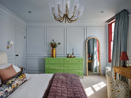
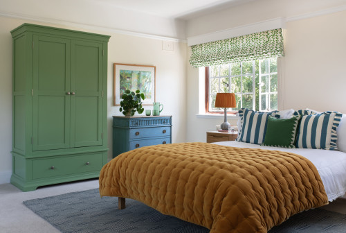
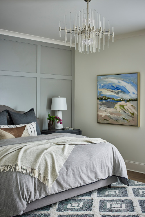
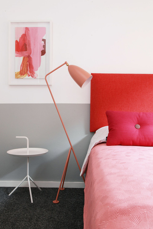
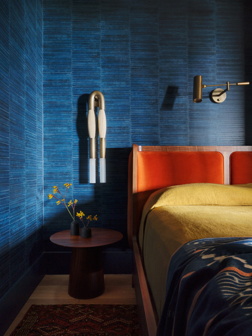
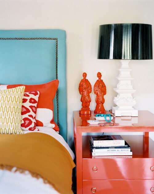
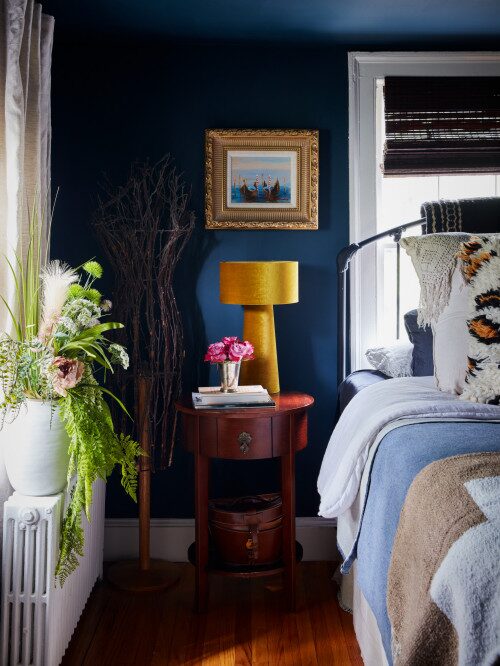
Apparently, this room gets direct sunlight. So, the designer decided to go for cooler colors – lots of blue, hints of green, and just a bit of orange-red.
I’d say, choose the vibe you like and go for it.
A little bit of color theory goes a long way
Basically, if you look at the color wheel, you will see that there are three primary colors – red, yellow, and blue.
They can not be created by mixing any other colors. They just exist.
If you mix two of the primary colors, you will get secondary colors: think of green (mixing one part of yellow and one part of blue).
Based on the proportion of primary colors in the mix, you can get tertiary colors, which are either to the warmer or cooler side.
For example, if you mix yellow and blue where the part of the yellow is larger, you will get a warmer green.
On the other hand, if you mix yellow with more blue, you will get a cooler green (blue-green).
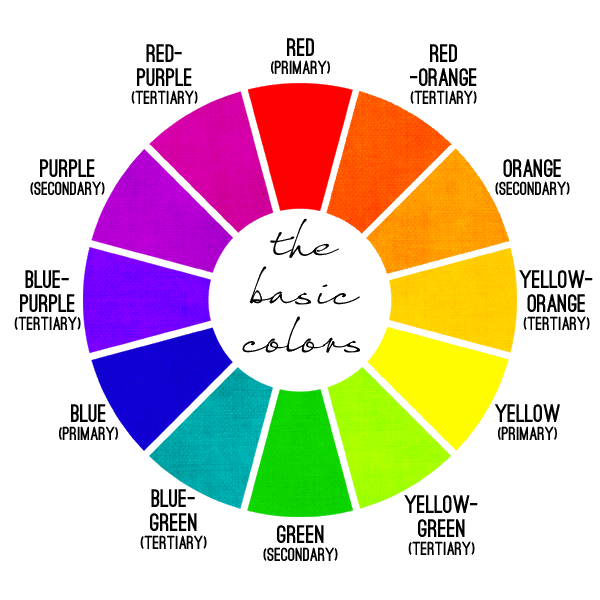
Once you decide about the color, the next step is to understand hue, tint, tone, and shade.
Hue is the dominant Color Family of the specific color you’re looking at. To define the hue of a particular color, answer the question: which primary color should I pick in the first place and mix with something else to re-create this color?
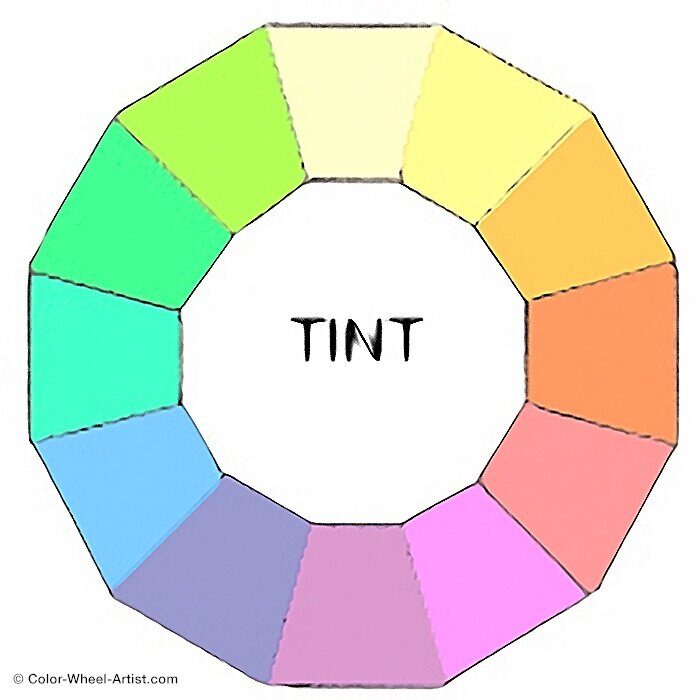
Tint a pure color mixed with white. This makes the color lighter and brighter. Think of pastel colors.
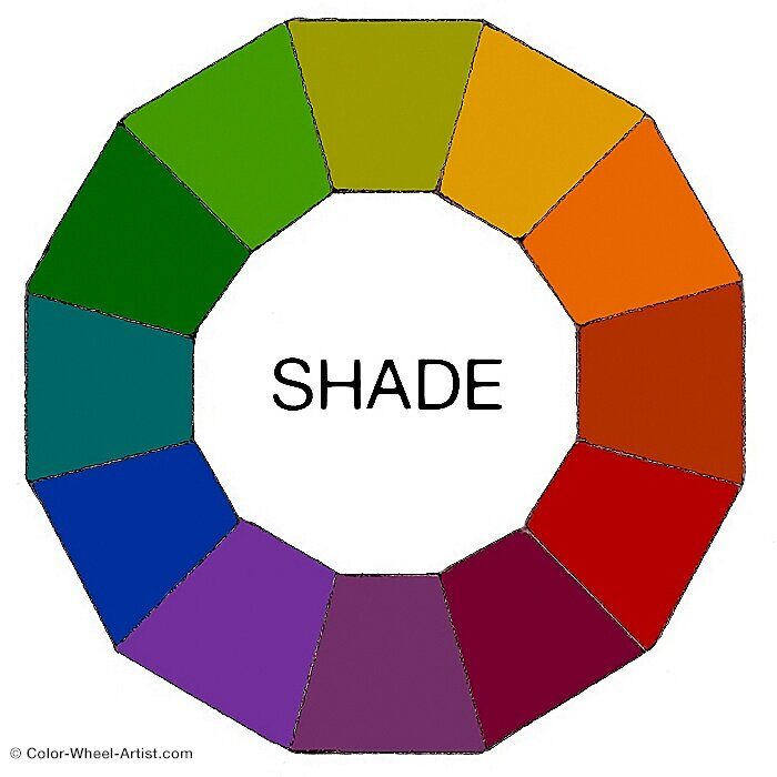
Shade is a pure color mixed with black to make the color darker.
A tone is a pure color mixed with gray (which is a mixture of black and white). This reduces the color’s intensity, creating a more desaturated or duller version.
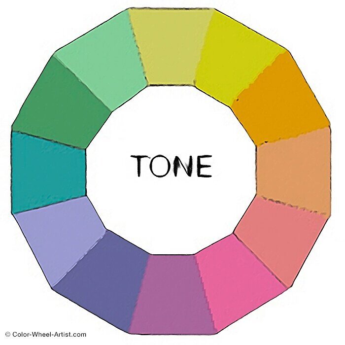
Which two colors are best for a bedroom?
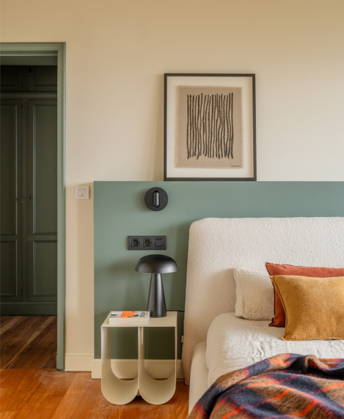
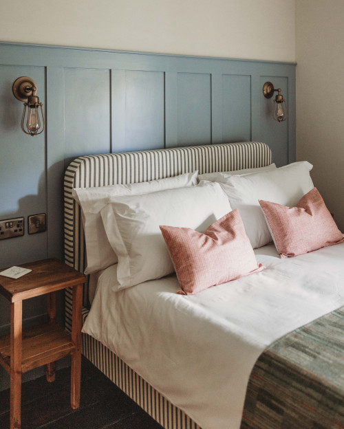
There is no one-size-fits-all approach when it comes fo best two colors for a bedroom, however, two colors consistently create a calm, elevated bedroom: a softened neutral + a muted accent color.
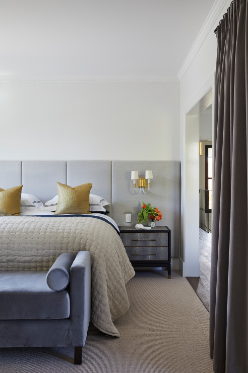
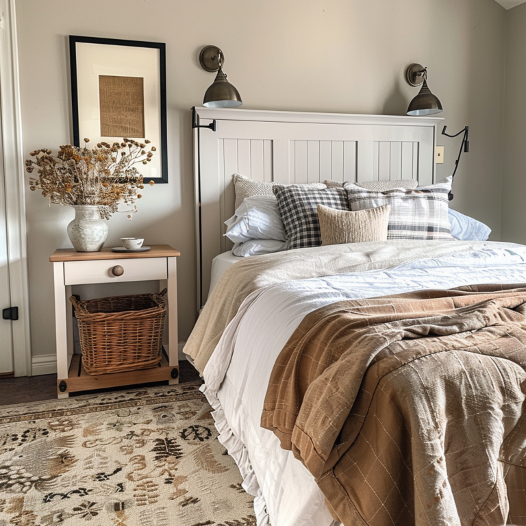
Think of combinations like warm beige and dusty blue, soft greige and sage, or charcoal and muted blush.
Why these work so well?
The neutral sets a relaxed foundation, while the accent adds character.
This balance also adapts beautifully to different orientations – cooler accents help sun-filled rooms feel balanced, and warmer ones can lift darker north-facing spaces.
When in doubt, choose the two colors you naturally gravitate toward in your wardrobe; they already reflect what feels comforting and beautiful to you.
What are the best two colors that go together?
What is the best color for sleep?
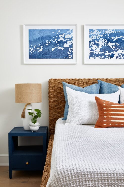
The most sleep-supportive color is soft blue—specifically desaturated, gray-blue tones.
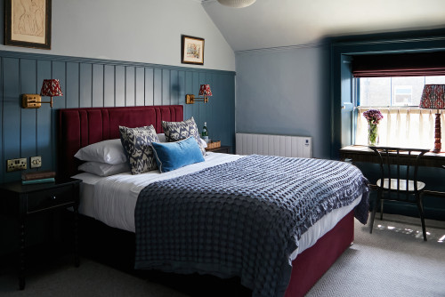
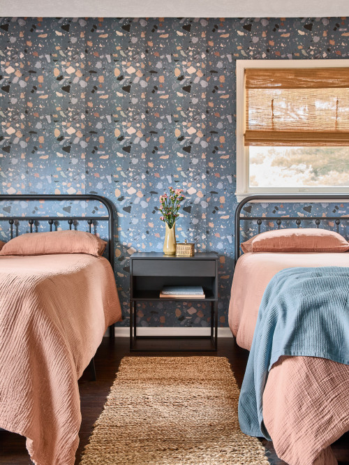
They naturally lower visual “noise,” calm the nervous system, and make a room feel cooler and more spacious. That combination helps your body wind down much faster.
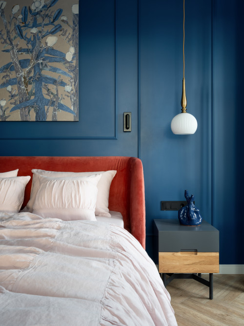
If blue isn’t your thing, the next best choices are muted greens, warm taupes, or soft lavenders.
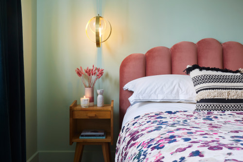
All of them sit in that sweet spot of low saturation and gentle undertones, which is exactly what you want in a room meant for rest rather than stimulation.
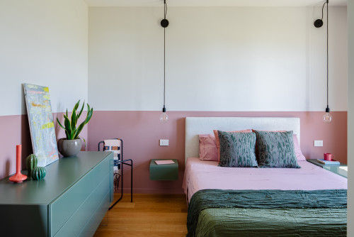
Which color gives positive energy in the bedroom?
If you want a bedroom that feels warm, optimistic, and still calm enough for rest, go for soft, warm hues with a gentle undertone.
Think of colors like peach, muted coral, terracotta blush, or warm clay.
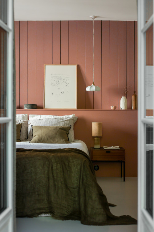
These tones carry a natural sense of comfort and uplift without feeling loud or overstimulating.
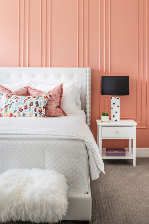
They work especially well in rooms that feel a bit dull or cold, because the warm undertone instantly brings life back into the space.
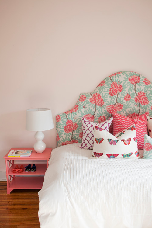
It’s that balance: energizing but still soothing.
That makes these colors such a good fit for a bedroom.
What is the most relaxing bedroom color?
If the goal is pure relaxation, nothing beats soft, desaturated blues.
These blue-gray tones naturally quiet the space: they visually recede, lower stimulation, and create that feeling of stepping into a calmer atmosphere the moment you walk in.
Muted greens come close, especially shades that lean toward gray. They feel restorative and grounded, almost like bringing a bit of nature indoors.
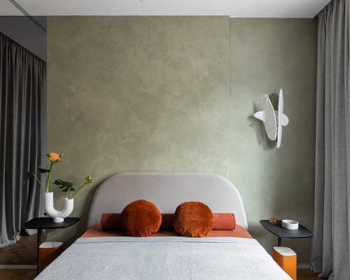
The key is low saturation.
Any gentle color, slightly grayed out, and not fighting for attention, will instantly make a bedroom feel more peaceful.
Which color is lucky for a bedroom?
In design, and even in traditions like feng shui, “lucky” usually means a color that supports calm, connection, and a sense of well-being.
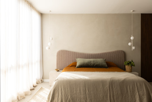
For most bedrooms, that tends to be soft earth tones: warm beige, clay, muted terracotta, or gentle browns.
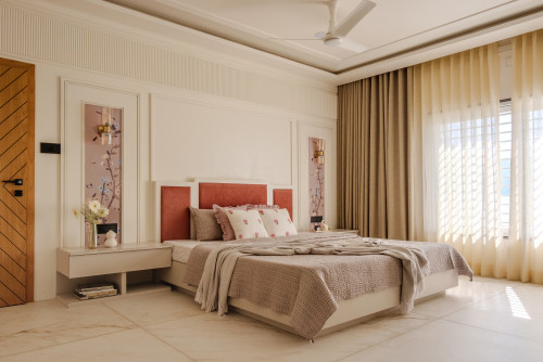
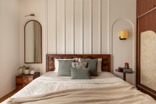
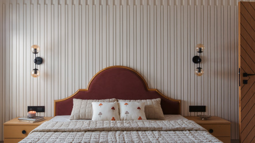
These colors feel grounding and stable, which sets the tone for a balanced day.

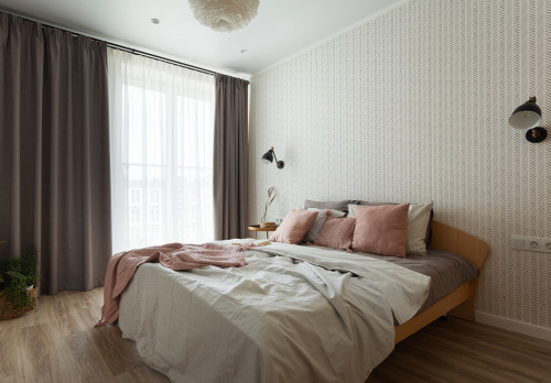
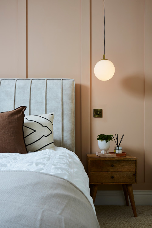
Another color often associated with good energy is soft pink. Not the sugary kind, but those barely-there blush tones that bring warmth, kindness, and a quiet sense of harmony into the room.
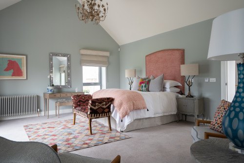
If you prefer cooler palettes, sage green is considered one of the most positive colors you can use.
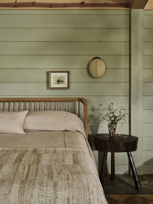
It’s fresh, calming, and symbolically tied to renewal – an easy way to make the space feel both peaceful and hopeful.
What is a happy color for a bedroom?
A “happy” bedroom color is one that feels uplifting without overpowering the calm you need in a sleeping space. Soft, warm tones are perfect for this.
Think peach, muted coral, warm blush, or a gentle apricot. They carry a natural sense of lightness and optimism, almost like bringing a bit of morning sunshine indoors.
If you lean toward cooler palettes, fresh but softened greens, like sage or a dusty mint, create that same bright, cheerful feel while staying soothing.
The common thread is low saturation: colors that feel joyful, but still relaxed enough for a room designed for rest.
What’s the in-colour for bedrooms in 2026?
Pantone LLC, the global authority on color and provider of professional color standards for the design industries, on September 11, 2025, released the Pantone® Fashion Color Trend Report Spring / Summer 2026 edition for New York Fashion Week (NYFW).
According to the report, here are 8 most popular colors for 2026:


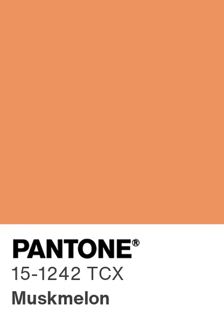


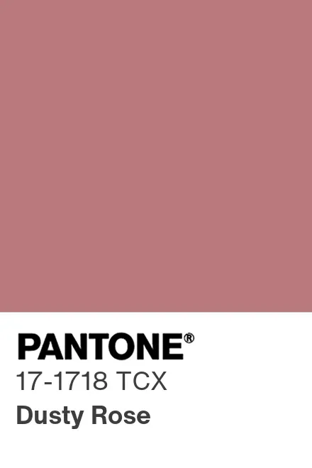
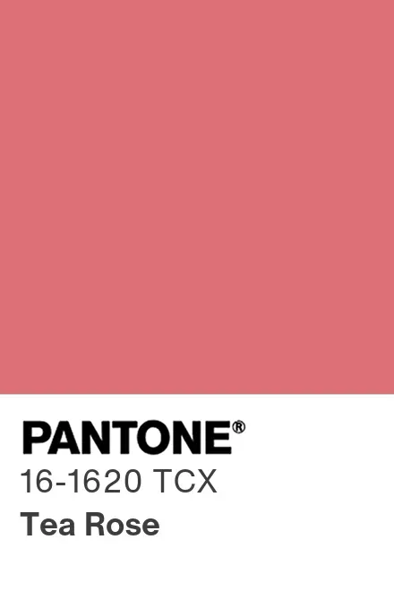

This means that the in-colour for bedrooms in 2026 are shades of pinks, purples and burgundy, in addition to green-yellows.
Conclusion
Choosing the right bedroom color isn’t about following strict rules.
it’s about understanding what feels good to you and how color behaves in the space you have.
Once you look at your own preferences, the room’s orientation, and a bit of basic color theory, the decision becomes much easier.
Whether you’re drawn to soft blues, warm earth tones, or something bold and expressive, the best choice is always the one that supports the way you want your bedroom to feel.
Let the color reflect your mood, your habits, and your taste, and the room will naturally come together.





One Comment
Comments are closed.