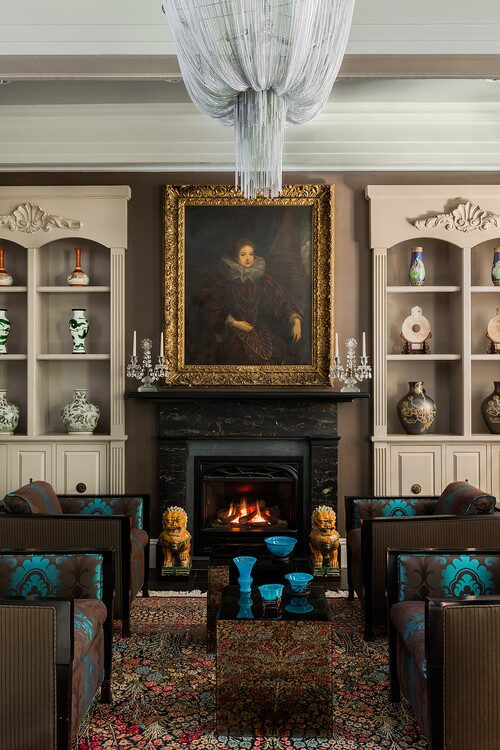
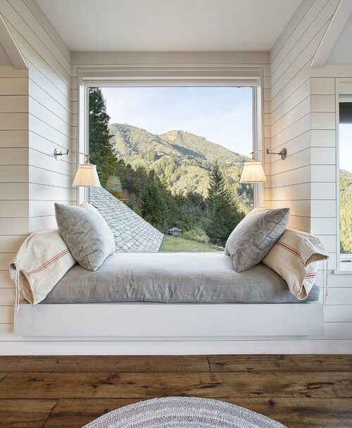
Animal print can bring a lot of personality into a living room, but it is also one of those design choices that can go wrong quickly. Too much of it can start to feel themed, while the wrong mix of colors and patterns can make the room look busy rather than collected. The key is knowing where to use it, how much to introduce, and what to pair it with. In this post, I’m sharing 10 animal print living room ideas that feel stylish, layered, and easy to live with, along with practical ways to recreate the look through chairs, stools, rugs, cushions, and other smaller pieces.
Posh Chic Cool is a participant in the Amazon Services LLC Associates Program, an affiliate advertising program designed to provide a means for sites to earn advertising fees by advertising and linking to Amazon.com. As an Amazon Associate, I earn from qualifying purchases at no extra cost to you. Disclaimer, Privacy Policy and Terms and Conditions
1. Start Small With an Animal Print Pillow
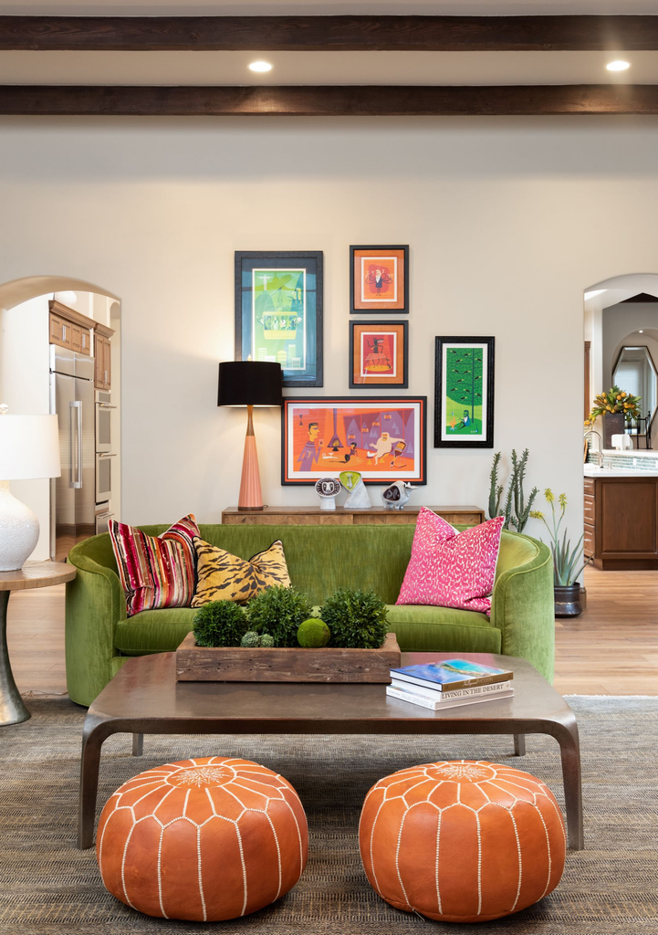
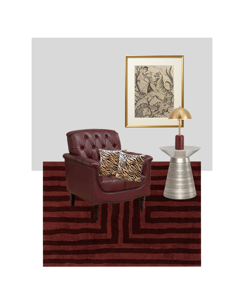
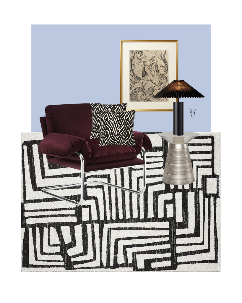
If you like animal print but are not ready to commit to a patterned sofa or large rug, a bench, stool, or pouf is a much easier place to start. The rooms here show why smaller doses work so well: the tiger and zebra patterns add energy, but they sit alongside solid upholstery, warm wood, colorful art, and simple accessories, so the room still feels layered rather than themed. You can use the same principle with an animal-print stool or upholstered bench and let it act as one playful accent among quieter pieces. I’d pair it with a solid sofa, a simple coffee table, and a few colors already present in the print so the whole setup feels connected.
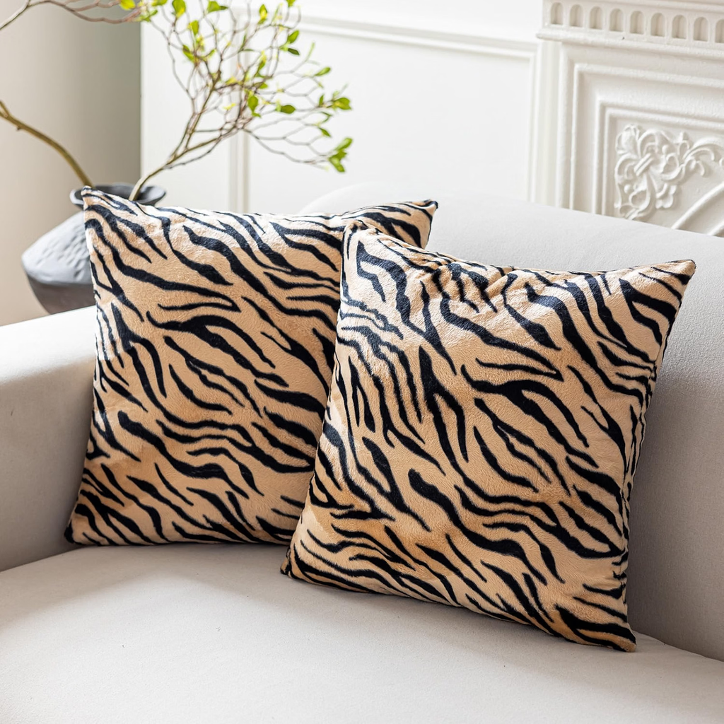
Here is another way to use the animal print pillows paired with the burgundy. Silver or gray can be a beautiful background that ties everything together.
2. Let a Chair Be the Statement Piece
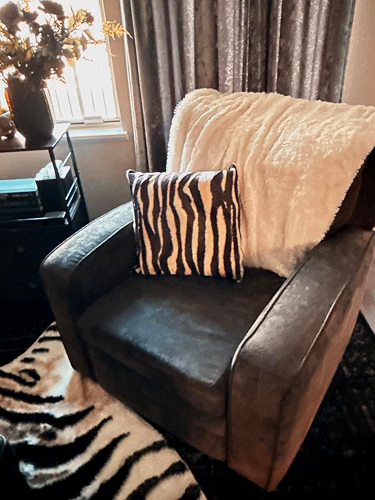
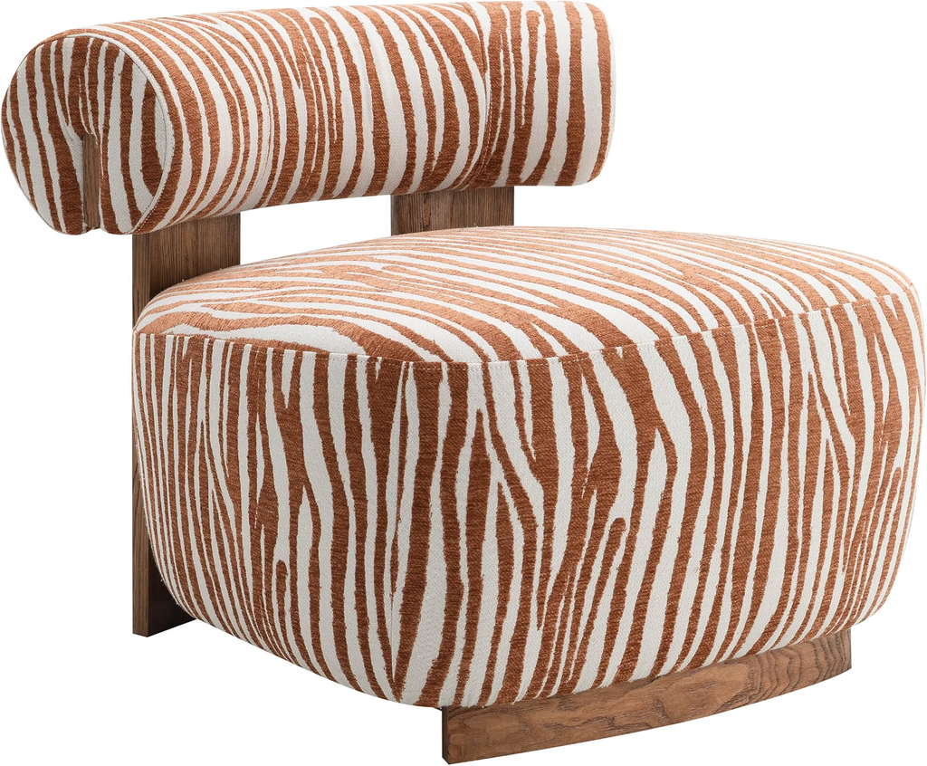
A single animal-print chair can carry the whole idea, so you do not need to repeat the pattern anywhere else in the room. Zebra works especially well for this because the black-and-white contrast is bold, but still easy to pair with warm wood, cream curtains, stone, or darker neutrals. If you are shopping for a similar piece, look for a chair with a simple silhouette so the print stays the focus rather than competing with an overly decorative shape. I’d style it with a small side table, a floor lamp, and a quieter rug or curtain treatment to give the chair some breathing room. If you prefer a softer take, a brown-and-cream zebra stripe can give you the same graphic effect with a warmer, more relaxed feel.
3. Treat Zebra Print Like a Neutral
Zebra print does not always have to read as the loudest element in the room. In a restrained palette like this one, the black-and-white sofa almost behaves like a neutral because the surrounding pieces stay soft and earthy. You can take the same approach by pairing zebra with cream upholstery, natural woven textures, warm beige rugs, and simple black accents. The abstract artwork helps too, pulling in muted mauve and brown so the room has color without competing with the pattern. If you want zebra to feel sophisticated rather than novelty-driven, keep the rest of the scheme edited and let the print become part of the overall mix instead of treating it like a one-off gimmick.
4. Use Animal Print on a Bench or Stool
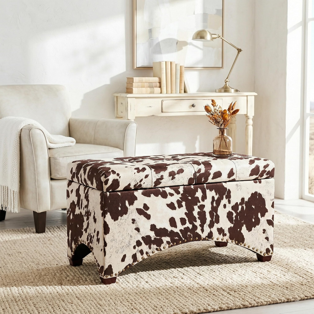
A bench, ottoman, or pair of stools is a smart place to experiment with animal print because these pieces already work as accents. You can tuck them under a console, pull them up for extra seating, or use a larger ottoman in place of a coffee table, so the pattern earns its place functionally too.
The blue-spotted stools show how animal print can feel fresher when the color is unexpected, while the brown-and-cream ottoman keeps things more classic and grounded. If you’re shopping for this look, pay attention to the shape as much as the print: simple cubes, clean-lined benches, and tailored ottomans tend to keep the pattern looking polished. Style them with solid upholstery, a quieter rug, and a few warm wood or metal accents so the room feels thoughtfully layered.
5. Use Animal Print on an Ottoman or a footstool Instead of the Sofa
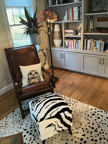
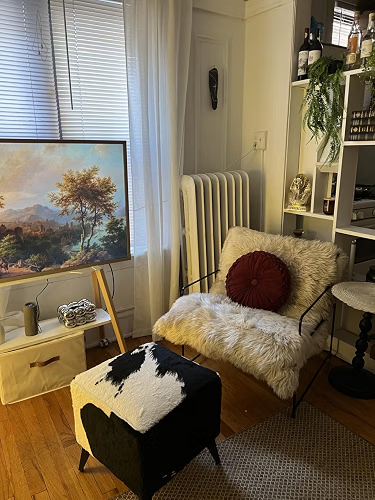
A footstool is one of the easiest places to bring in animal print when you want the pattern to feel deliberate rather than dominant. Zebra or cowhide works especially well here because the smaller scale lets you add contrast right at the center of the seating area, where it naturally catches the eye. I’d keep the main chair or sofa fairly simple, then use the footstool to introduce the graphic moment. The rest of the room can stay layered with books, artwork, wood furniture, and softer textiles, which helps the print feel like part of a collected scheme. It’s also a practical piece to shop for, since a footstool can double as extra seating or a small surface when you need it.
6. Mix Animal Print With Warm Wood and Natural Materials
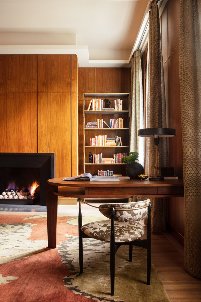
Animal print tends to sit especially well beside materials that already have warmth and texture. Walnut, teak, leather, woven fibers, linen, and earthy rugs give the pattern a natural context, which helps it feel more sophisticated and less like a novelty accent. In these rooms, the printed chairs are surrounded by rich wood tones and muted, earthy colors, so the pattern feels woven into the overall scheme rather than added on top.
If you want to recreate the look, start with the furniture and finishes you already have, then choose an animal print that shares some of those same browns, creams, or warm neutrals. A wood desk, vintage-style side table, textured curtain, or natural-fiber rug can all help pull the room together and give the print a more collected, layered feel.
7. Pair Leopard With Rich, Solid Colors
Leopard really comes into its own when you give it a strong color to play against. Deep burgundy, olive green, cobalt blue, and rust all have enough weight to stand beside the pattern, so the room feels confident rather than busy. You can see that in these examples: the leopard wallcovering looks sharper next to the wine-colored rug, the darker print feels especially rich against olive walls, and the spotted rug gives the blue chair even more presence.
If you want to try this at home, choose one saturated color as your anchor and let the animal print act as the secondary pattern. Warm wood, black accents, and simpler upholstery can then do the quiet work of holding everything together. This is a great route if you want animal print to feel expressive and grown-up rather than safe or overly neutral.
8. Use Black and White Animal Print for a Cleaner Look
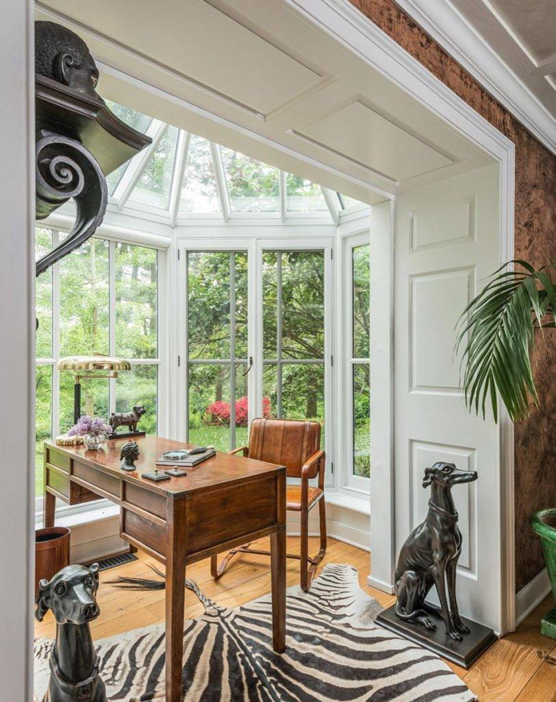
If you like the idea of animal print but prefer a more restrained palette, black and white is one of the easiest directions to work with. A zebra rug can introduce plenty of pattern while still sitting comfortably alongside white walls, dark accents, warm wood, and simple furniture. In this room, the print feels graphic rather than decorative, which gives the space a sharper, more collected look.
You can take the same approach with a rug, cushion, stool, or upholstered chair and then repeat the black elsewhere through lighting, frames, or smaller accessories. Warm wood is especially useful here, as it softens the contrast and keeps the room from feeling too stark. For a cleaner result, let the zebra print be the main pattern and keep the surrounding textiles relatively quiet.
9. Layer Animal Print Into a Collected, Eclectic Living Room
Animal print feels especially convincing in an eclectic living room because it does not have to carry the whole design on its own. Let it sit alongside florals, vintage furniture, woven textures, sculptural lighting, and richer colors so the room feels layered over time rather than built around a single motif.
Tiger-striped cushions can work beautifully with botanical wallpaper, while leopard upholstery can sit comfortably beside rust, olive, rattan, or dark wood. The key is to repeat a few colors or materials across the room so the different patterns still feel connected.
If you are shopping the look, focus less on finding a matching “set” and more on choosing one animal-print piece that complements furniture and accessories you already love.
10. Keep the Rest of the Room Quiet When the Print Is Bold
When the animal print is doing this much visual work, the rest of the room can afford to be very restrained. A zebra sofa already brings strong contrast and movement, so simple walls, soft curtains, a low coffee table, and a few sculptural pieces are enough to complete the space.
The same principle works with a bold spotted rug: keep the larger furniture mostly solid and let the pattern become the focal point at floor level. If you are shopping for this look, resist the urge to add several competing prints and instead invest in quieter pieces with good shapes and textures. Cream upholstery, warm wood, glass, black accents, and softly colored textiles all give animal print room to stand out while keeping the living room polished and easy on the eye.
Conclusion
Animal print works best when you treat it as part of the room rather than the entire theme. A zebra chair, leopard cushion, patterned footstool, or bold rug can be enough to give the space character, especially when the surrounding furniture, colors, and materials are thoughtfully chosen. Start with one piece you genuinely love, then build around it with solid upholstery, warm wood, natural textures, or richer accent colors. You can always add more later, but giving the print room to breathe is usually what keeps the result looking polished. The goal is not to create a safari-inspired living room, but to use animal print as one more layer in a space that feels personal and well put together.