Tile countertops have a bad reputation, and honestly, it’s not entirely undeserved.
Poor grout choices, busy patterns, clumsy edges, and mismatched cabinetry have made them synonymous with outdated, unhygienic kitchens.
But here’s the truth most renovation guides miss: tile itself is not the problem. Design is.
When treated as an architectural surface rather than a budget compromise, tile countertops can look intentional, tactile, and strikingly modern.
In fact, many of today’s most compelling European kitchens use tile precisely for its graphic clarity and crafted feel.
In this guide, I’ll walk you through 8 strategic, architect-approved ways to design a kitchen with tile countertops so they feel clean, contemporary, and deliberately designed, not dated or “disgusting.”
1. Treat the Tile Countertop as a Monolithic Surface
One of the fastest ways tile countertops start to feel dated is when they’re treated as a small, isolated surface.
Modern kitchens do the opposite.
By extending the same tile across the countertop, backsplash, and occasionally the island face, the tile stops reading as a decorative finish and starts functioning as architecture.
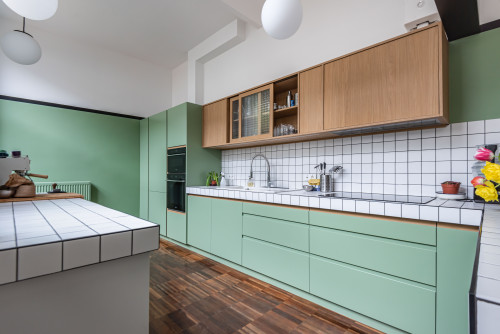
This monolithic approach visually simplifies the space, eliminates visual breaks, and makes the tile feel deliberate rather than piecemeal.
Extend the same tile:
- horizontally (countertop)
- vertically (backsplash)
- sometimes down the island face
This removes the “patchwork” feeling and makes the tile read as one architectural plane.
2. Embrace Color
Neutral tile countertops tend to fade into the background – and that’s often why they read outdated. (not always)
Introducing an intentional color instantly reframes tile as a design feature rather than a leftover finish.
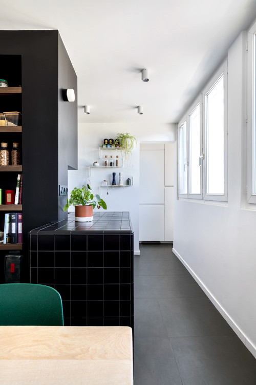
Soft, desaturated tones like sage green, muted teal, warm yellow, or dusty grey add depth and character giving tile countertops a modern, curated feel instead.
Right colored tile immediately shifts the countertop from “DIY relic” to European design move.
3. Square Tiles Only. No Bevels
The shape and finish of the tile matter more than most people realize.
Square tiles with flat edges read crisp, graphic, and modern, while beveled, glossy, or rounded tiles immediately date a kitchen.
If the goal is a contemporary look, the rule is simple: keep the geometry honest and the surface understated.
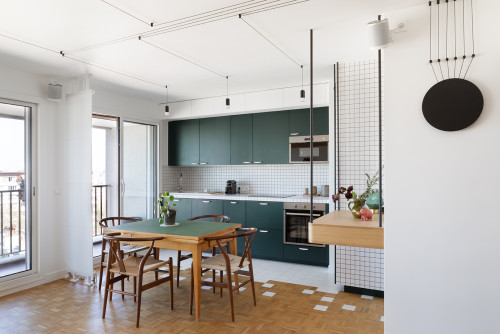
Stick to:
- true square tiles
- flat edges
- matte or satin finishes
Bevels, gloss, and rounded edges scream early 2000s.
4. Design the Edge Deliberately
Countertop edges are one of the most overlooked details in kitchen design, and one of the easiest places for tile to look dated.
Metal trims and bullnose edges break the visual flow and immediately signal an older renovation.
A deliberately designed edge, whether tiled, wrapped, or paired with a slim wood detail, is what makes a tile countertop feel resolved and contemporary rather than unfinished.
No metal trims, no bullnose!!
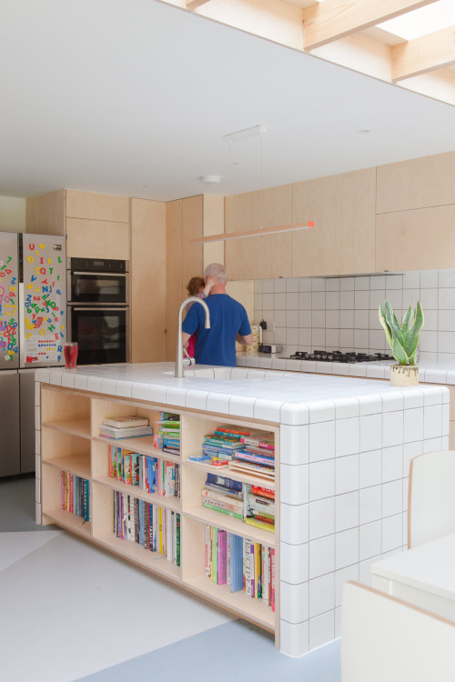
Best options:
- tiled waterfall edge
- slim wood edge detail
- crisp tile wrap with clean termination
Edges are where dated kitchens usually fail.
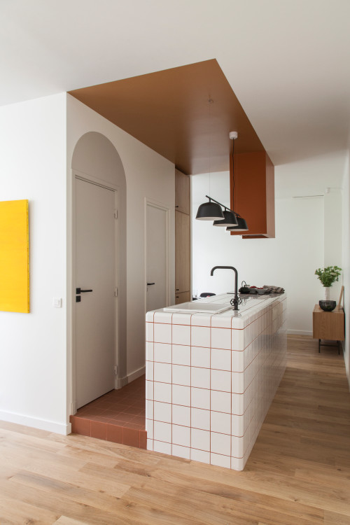
5. Pair with Ultra-Simple Cabinetry
Tile countertops already bring texture and visual rhythm to a kitchen, which means the surrounding cabinetry needs to do less, not more.
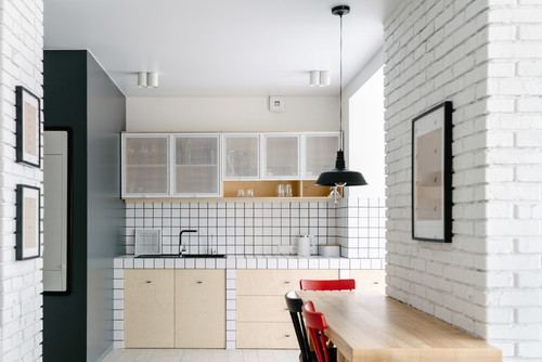
Ultra-simple cabinet fronts, restrained hardware, and calm finishes allow the tile to read as intentional rather than busy.
The more graphic the countertop surface, the quieter and more disciplined the cabinetry should be.
Best choices of surroundings:
- slab fronts
- minimal hardware
- flat paint or natural wood
The busier the counter texture, the quieter everything else must be.
6. Limit the Palette to 3 Materials Max
Tile countertops already have texture, pattern, and visual rhythm, which means they demand a disciplined material palette around them.
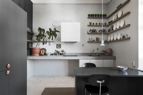
When too many finishes compete for attention, tile quickly starts to feel chaotic or visually heavy.
The most successful kitchens limit the composition to three primary materials (typically tile, wood, and one supporting accent such as metal or paint) allowing each element to read clearly and intentionally within the overall design.
Successful examples follow this rule:
- tile
- wood
- one accent (metal or paint)
Anything more makes the tile feel chaotic instead of intentional.
7. Use Warm Lighting Strategically
Lighting has an outsized impact on how tile countertops are perceived, often more than the tile itself.
Cool or uneven lighting exaggerates grout lines and surface texture in an unflattering way, making tile appear harsher or dirtier than it is.
Warm, well-placed under-cabinet lighting softens contrasts, enhances color depth, and allows tile surfaces to read cleaner, richer, and more refined.
Under-cabinet lighting is critical:
- soft, warm temperature (2700–3000K)
- even wash across grout lines
Good lighting instantly makes tile look cleaner and richer.
8. Edit What Lives on the Counter
Even the best-designed tile countertop can feel dated if it’s visually overcrowded.
Because tile already introduces pattern and texture, what sits on top of it matters just as much as the surface itself.
A restrained approach to styling – limiting objects, choosing natural materials, and avoiding clutter – allows the countertop to read as intentional and elevated rather than busy or neglected.
Modern tile kitchens are styled sparingly:
- 1–2 objects max
- ceramic, wood, or glass
- no plastic, no clutter
Visual discipline elevates everything.
Conclusion
Tile countertops are not inherently outdated. They’re simply unforgiving of poor design decisions.
When treated as an architectural surface, paired with restraint, and detailed with intention, tile can feel tactile, modern, and quietly confident.
The difference lies in discipline: controlled color, simplified forms, deliberate edges, warm lighting, and edited surroundings.
Get those fundamentals right, and tile stops reading as a compromise and starts functioning as a purposeful design choice that gives a kitchen character rather than taking it away.