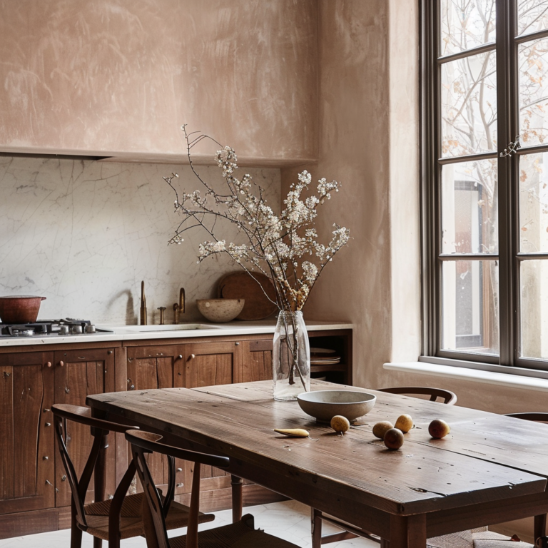
One of my daily pleasures is scrolling through design magazines or websites and inhaling the magic of the latest masterpieces.
Through years of studying color theory and observing how designers use it in practice, I have developed a sense of what a good color palette looks like.
Here are more than 20 kitchen design masterpieces that absolutely nail the color.
Warm wood with charcoal gray & bright accents
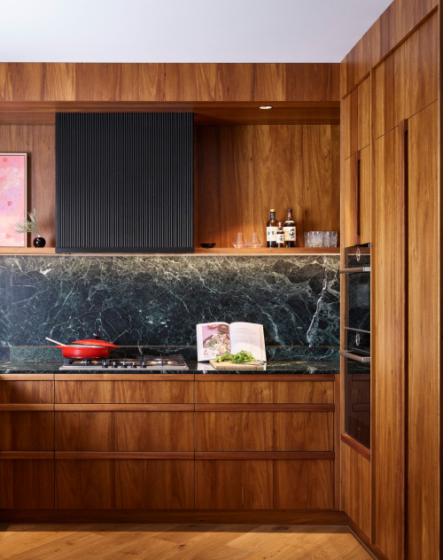
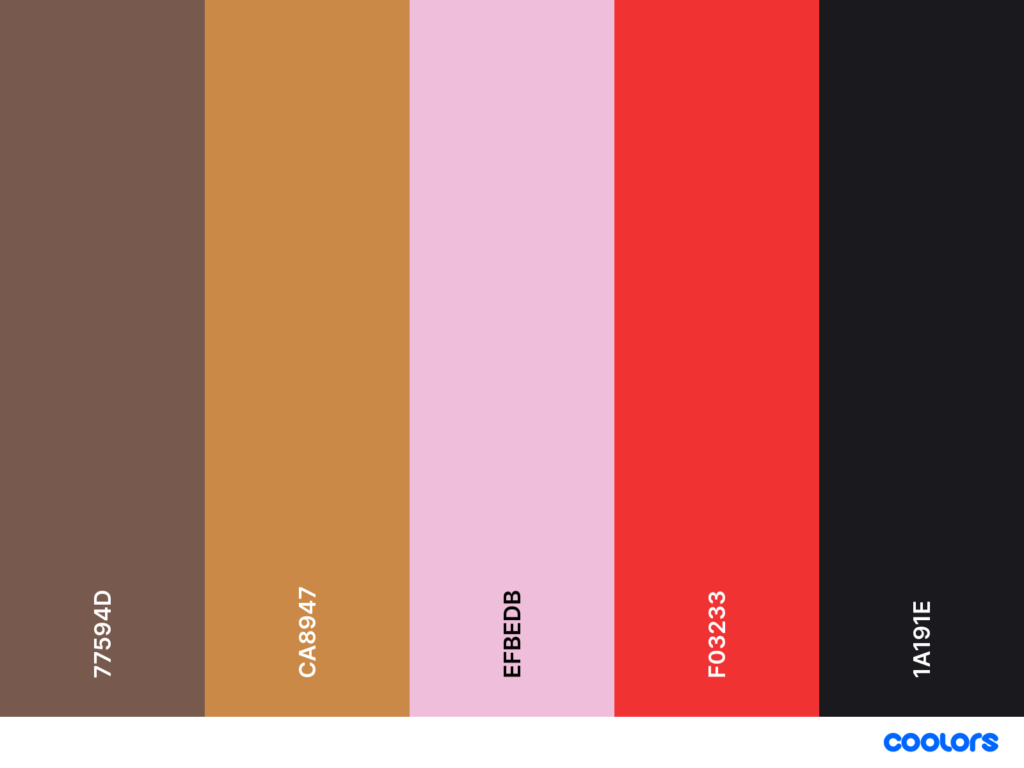
It’s one of those Kitchen Color Palette Ideas that feels naturally expensive, almost effortless, the way good design should be.
The walnut cabinetry brings a quiet warmth, while the dark stone and ribbed hood create that grounded, architectural contrast designers love.
And then, just when the palette settles, you get a bright accent, a little spark of red or blush, reminding you that kitchens can be both sophisticated and full of life.
Warm wood and avocado green
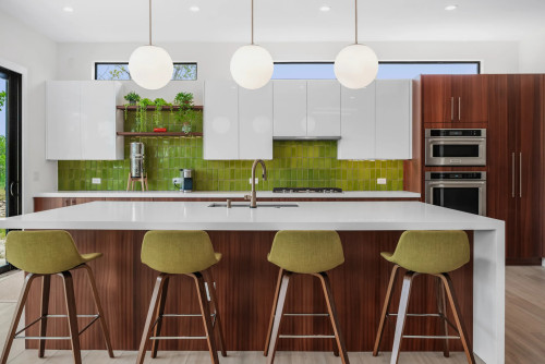
This is one of those Kitchen Color Palette Ideas that feels both unexpected and completely natural once you see it in action.
The earthy walnut grounds the space, giving it warmth and depth, while the green tiles introduce a lively energy that instantly lifts the entire palette.
It works because the tones share a similar softness – nothing too cool, nothing too sharp – making them perfect companions in both Small Kitchen Colour Schemes and open-plan layouts.
If you wanted to push this combination further, muted olives, creamy whites, or even a soft mushroom beige would blend beautifully into the same Kitchen Colour Palettes.
However, pure primary greens or overly cool grays would fight the warmth of the wood rather than complement it.
When the undertones align, the whole space feels harmonious, and this kitchen is a perfect example of how wood and painted cabinets mixed can look effortlessly expensive and timeless.
warm wood, baby blue, and orange red
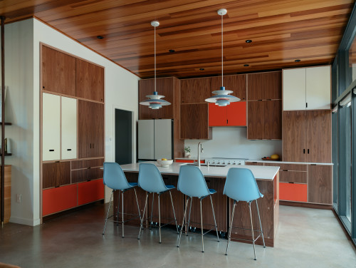
This kitchen Color Palette feels bold yet strangely harmonious, like a palette pulled straight from a beautifully composed mid-century painting.
The reason it works is simple color theory: the walnut brings warmth and stability, the blue cools everything down just enough, and the orange-red slices through with a hit of energy that keeps the whole space from feeling too safe.
This is a brilliant example of how Wood And Painted Cabinets Mixed can create rhythm and movement in a kitchen without overwhelming it.
Wood, charcoal gray, salmon pink and orange red
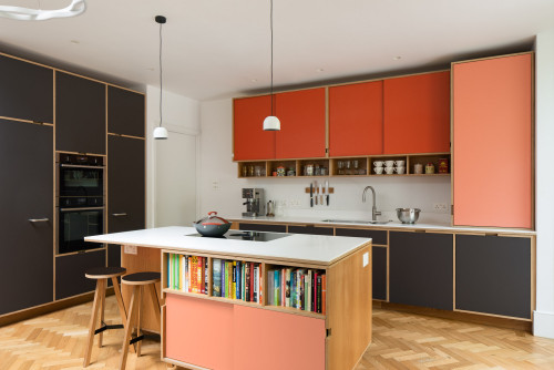
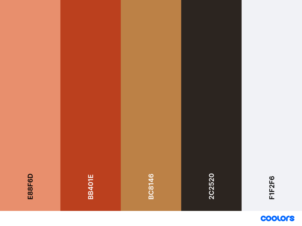
There’s a beautiful confidence in pairing warm wood with charcoal gray, salmon pink, and a punchy orange-red.
It’s one of those Kitchen Color Palette Ideas that feels contemporary but still tactile and human.
The palette works because everything is anchored by the deep gray – it quiets the intensity of the warm tones and lets the pinks and reds read as refined rather than overwhelming.
The salmon adds softness, the orange-red brings energy, and together they create a rhythm that makes the cabinetry feel like a curated set of color blocks rather than random contrasts.
If you wanted to expand the palette, muted clay, dusty rose, or a warm cream would slip in effortlessly and keep the harmony intact.
What wouldn’t work as well is introducing cool, stark whites or icy blues. They would break the warmth and disrupt the balance between these earthy, saturated tones.
When used thoughtfully, this combination becomes a masterclass in Two Tone Kitchen Cabinets (or even 3 Tone Kitchen Cabinets) that still feels expensive, intentional, and architect-approved.
Shades of green
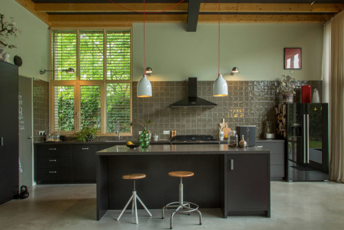
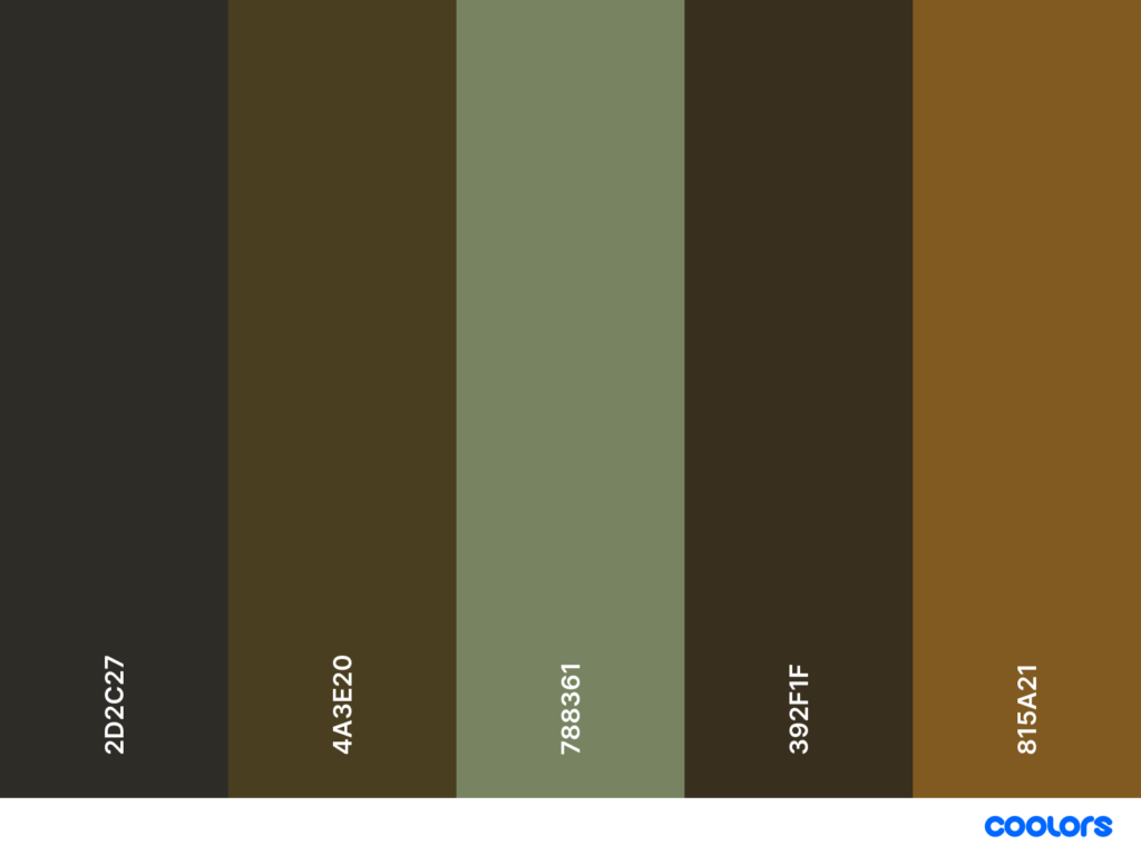
There’s a quiet poetry in kitchens built from layered greens, especially when they lean into those smoky, earthy undertones rather than the predictable crisp mint or sage.
This palette works because every shade feels pulled from the same landscape: deep olive, soft moss, warm brown-green, and charcoal grounding everything in place.
It’s one of those Kitchen Colour Palettes that proves you don’t need bright colors to make a statement; depth and subtlety can feel just as luxurious.
The variation in temperature keeps the space from feeling flat, while the glossy tile brings a touch of light that balances all the matte, moody surfaces.
Warm wood, white and scarlet red
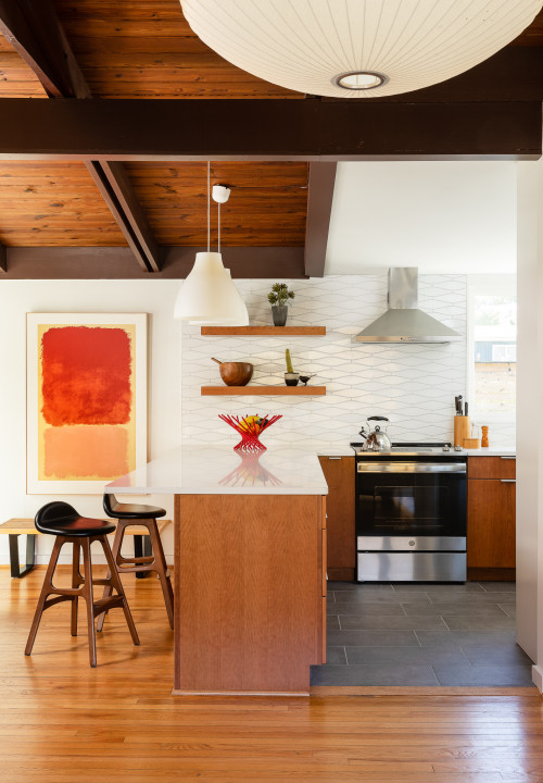
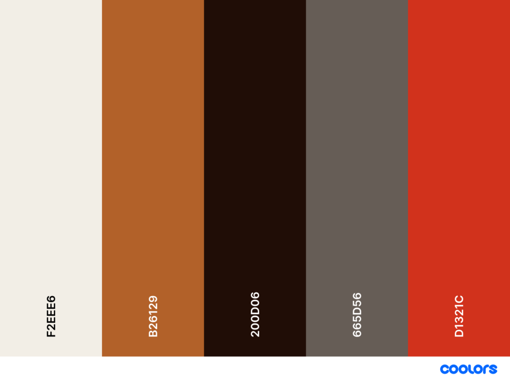
There’s a beautiful honesty in the combination of warm wood, crisp white, and that unapologetic scarlet red.
The warm timber sets the tone, creating that soft, welcoming base, while the white surfaces keep everything bright and airy.
Then the scarlet steps in and steals the show, adding just enough visual tension to make the palette feel intentional and architect-designed rather than predictable.
shades of ochre
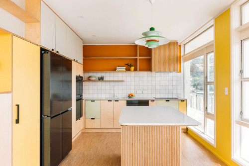
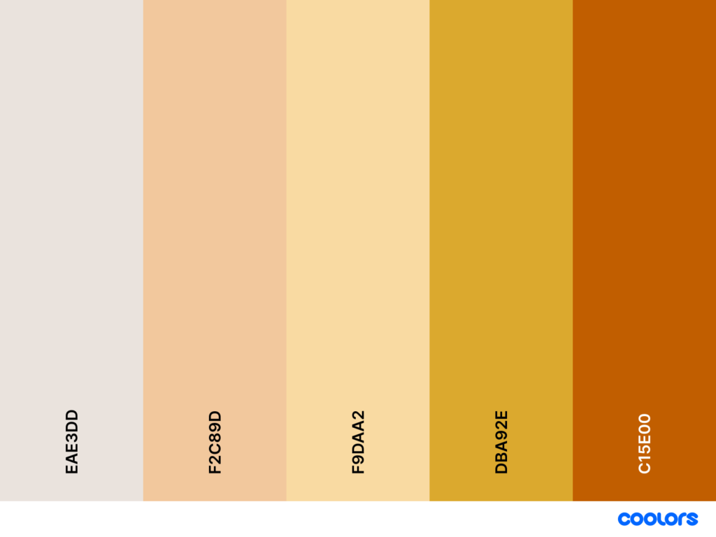
Those soft honey tones, muted yellows, and warm golden notes instantly make a space feel sun-kissed.
This palette works because each color shares the same warm undertone, creating a seamless gradient that feels both playful and sophisticated.
Instead of relying on stark contrast, it leans into harmony, which is why it’s such a strong contender for Kitchen Colour Combination Ideas and even Small Kitchen Colour Schemes.
The light woods and creamy neutrals keep everything grounded, while the deeper mustard and amber moments add just enough depth to feel intentional rather than flat.
If you wanted to expand this palette, soft apricot, warm beige, or a gentle terracotta would blend beautifully without breaking the warmth.
Terracotta and a sprinkle of green
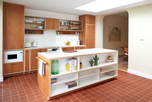
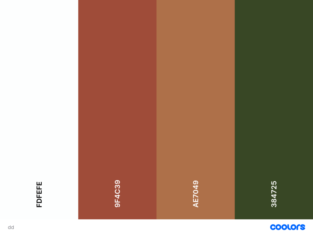
There’s a grounded warmth in terracotta that instantly makes a kitchen feel lived-in and soulful, and when you add just a sprinkle of green, the whole palette comes alive.
This combination works because terracotta and warm wood sit comfortably in the same earthy spectrum, creating a cohesive base, while the deep green acts as a subtle counterpoint that keeps the space from feeling too monotone.
The crisp white surfaces act like a breath of fresh air, giving the palette room to breathe and keeping it light enough for Small Kitchen Colour Schemes or open-plan layouts.
Wood, salmon pink, and accents of blue-green
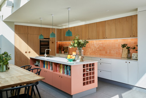
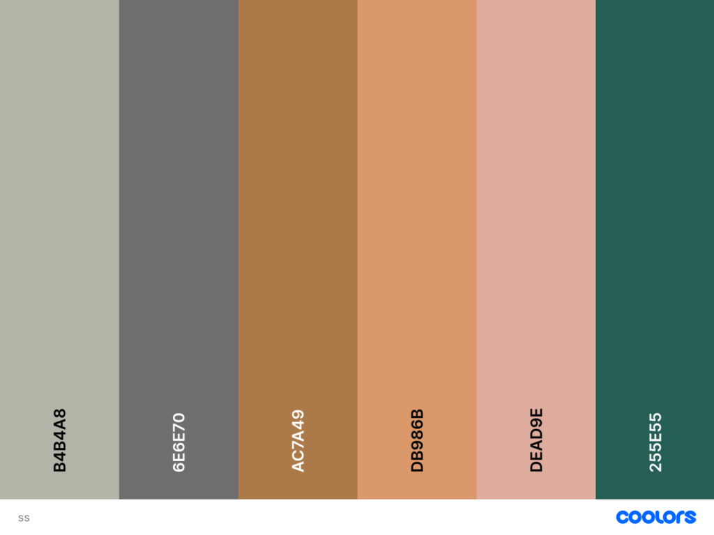
There’s a soft, luminous quality to the combination of warm wood, salmon pink, and those beautiful blue-green accents.
It’s one of those Popular Kitchen Color Combinations that feels both charming and elevated, like a modern reinterpretation of mid-century optimism.
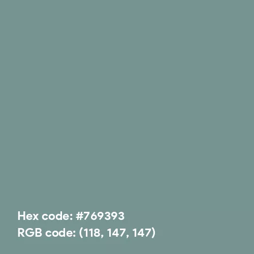
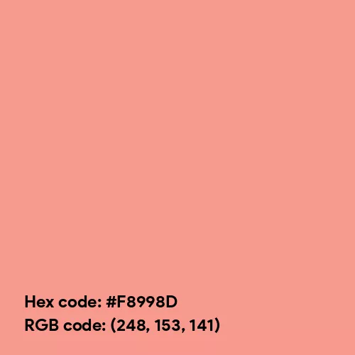
The wood brings natural warmth, the salmon pink adds a gentle sweetness, and the blue-green introduces just enough cool contrast to keep the palette from drifting into overly warm territory.
This balance of temperatures is exactly why the space feels fresh, intentional, and architect-designed rather than simply colorful.
If you wanted to expand this palette, dusty teal, soft coral, or even a muted honey tone would flow effortlessly within the same Kitchen Colour Schemes.
Blocks of warm wood and olive yellow with accents of navy blue
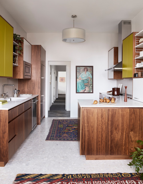
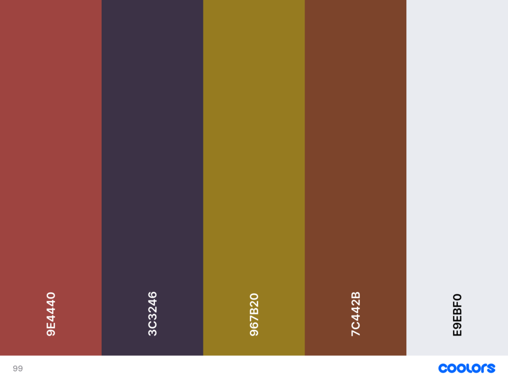
There’s a wonderfully eclectic charm in kitchens that pair warm wood with olive-yellow blocks and just a whisper of navy blue.
This palette works because each hue plays a very specific role: the walnut anchors the space with depth and grain, the olive yellow injects a sharp, almost architectural freshness, and the navy blue cuts through the warmth with a cool, grounding note.
It’s one of those Kitchen Color Palette Ideas that looks daring on paper but feels unexpectedly harmonious in real life, thanks to the shared earthy undertones running through the wood and the olive.
The navy works as an accent rather than a dominant color, which is key; too much of it would overpower the palette, but in small doses it adds sophistication and keeps the scheme from drifting into overly rustic territory.
If you wanted to expand this look, muted burgundy, soft clay, or a dusty teal would integrate beautifully without disrupting the visual balance.
Perfect mix of neutrals
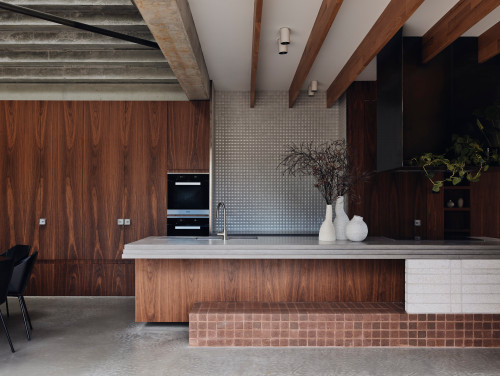
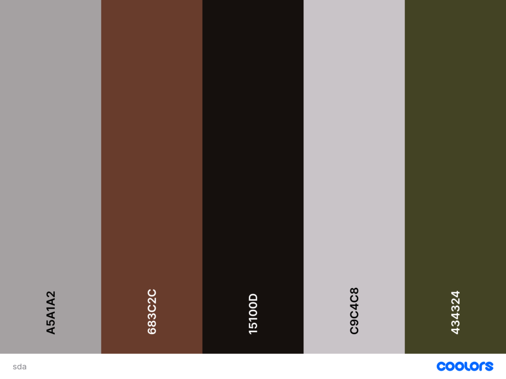
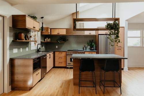
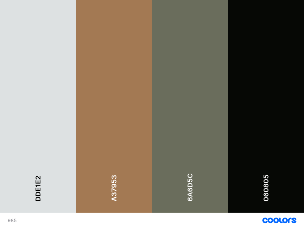
There’s a quiet strength in a kitchen built from the perfect mix of neutrals – wood, charcoal, warm gray, soft taupe, and a whisper of earthy green all working together like a beautifully tuned palette.
This combination works because every hue shares a subtle warmth, even the cooler grays, creating a cohesive foundation that feels calm, architectural, and endlessly timeless.
The deep black-brown moments add weight, the walnut adds soul, and the muted gray tiles introduce just enough texture to keep the space from feeling flat.
It’s a masterclass in Kitchen Colour Palettes for anyone who loves a restrained scheme that still feels deeply luxurious.
Autumn color palette
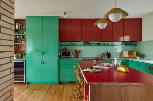
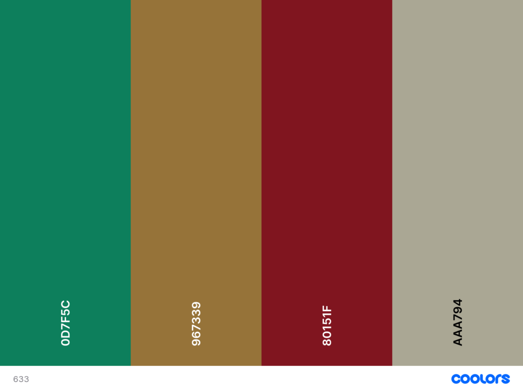
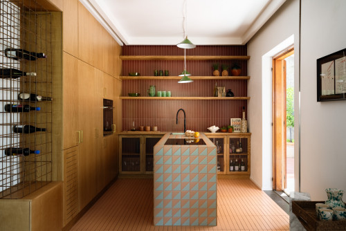
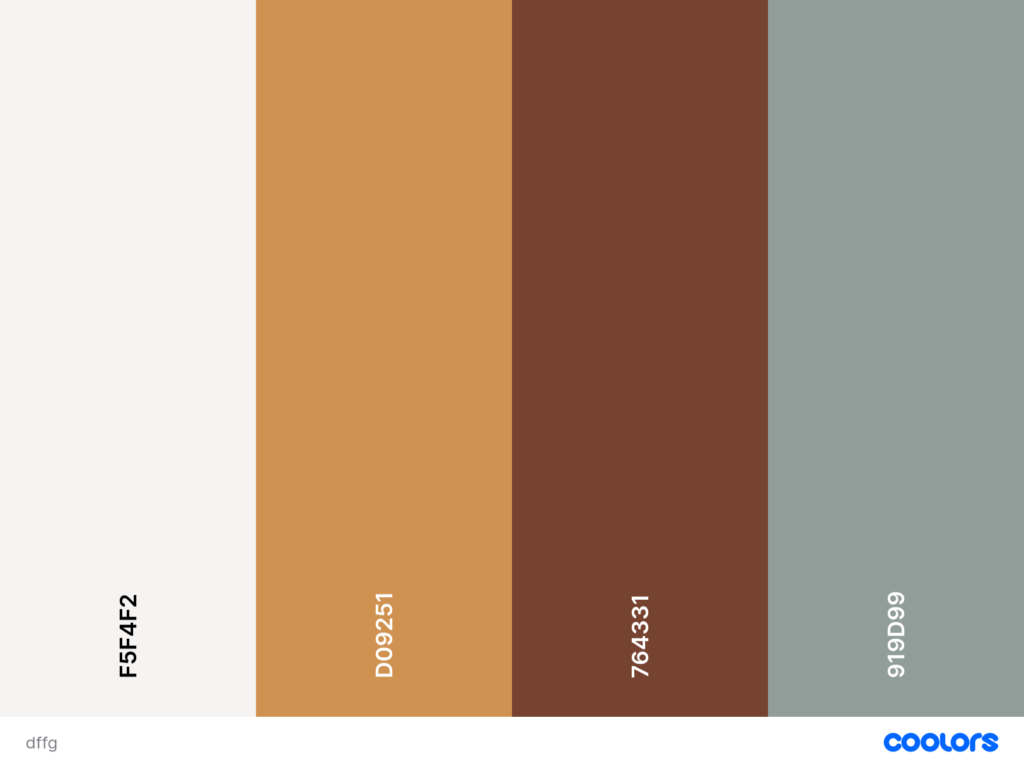
There is something irresistibly nostalgic about an autumn-inspired kitchen palette – those rich greens, deep reds, earthy browns, and warm ochres that instantly wrap the space in comfort.
This combination works because every hue belongs to the same seasonal temperature: warm, grounded, and softly saturated.
The red–green pairing creates a natural complementary contrast, but because both tones are muted, the effect feels sophisticated rather than loud.
The caramel woods and golden accents add depth, while the sage and mossy greens keep the palette from becoming too heavy, making it ideal for both Small Kitchen Colour Schemes and open-plan layouts.
Dusty pink & charcoal gray
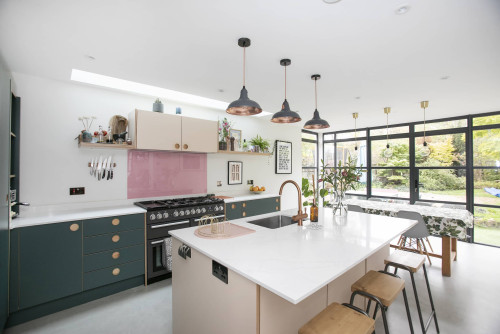
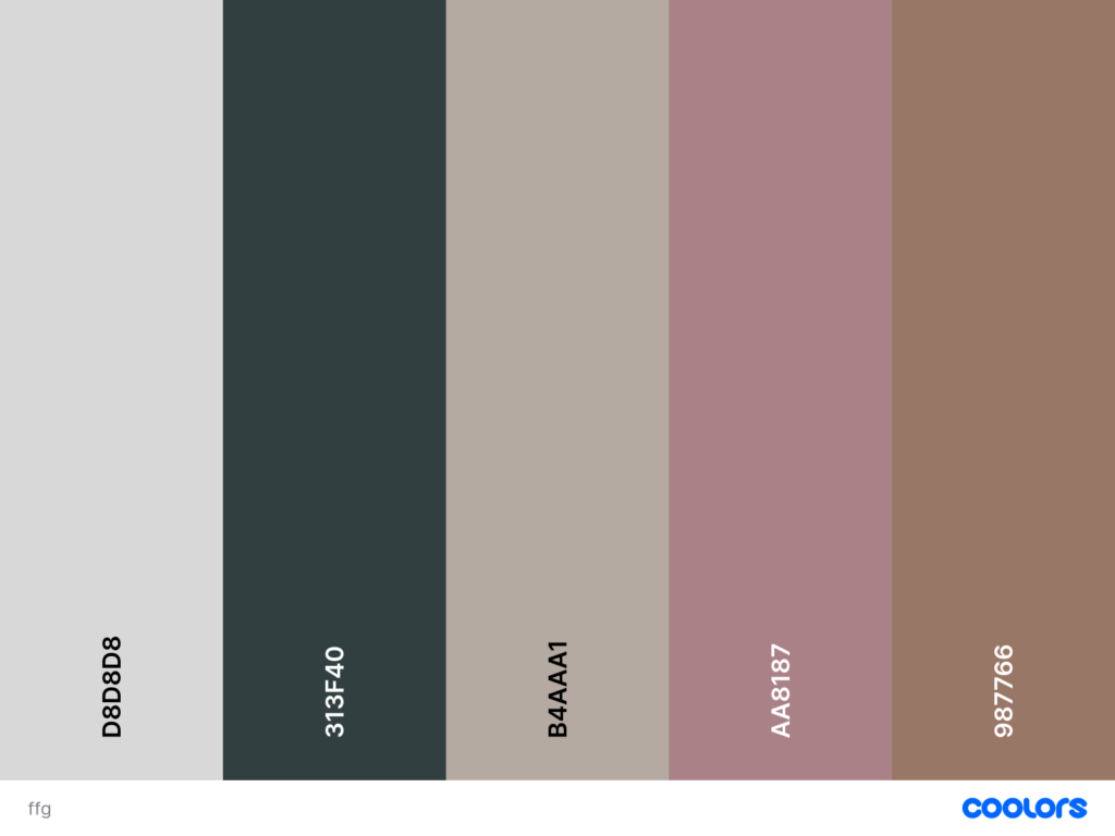
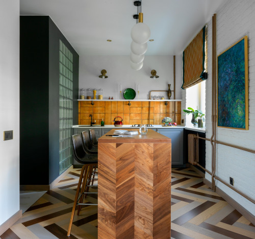
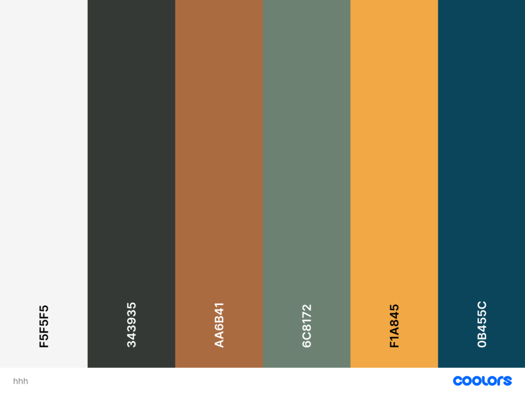
There’s a quiet romance in pairing dusty pink with charcoal gray – soft, moody, and unexpectedly sophisticated.
This palette works because the pink isn’t sugary or bright; it’s muted, almost earthy, which lets it sit comfortably alongside the deep charcoal without creating harsh contrast.
The result is one of those Popular Kitchen Color Combinations that feels modern yet gentle, perfect for both Small Kitchen Colour Schemes and open-plan family spaces.
The warm neutrals and soft taupes in the mix keep everything cohesive, while the charcoal anchors the room and gives the pink a sense of purpose rather than whimsy.
Raspberry red accents vs dark wam neutrals
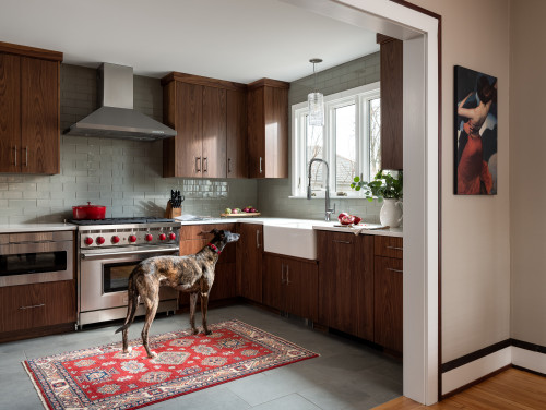
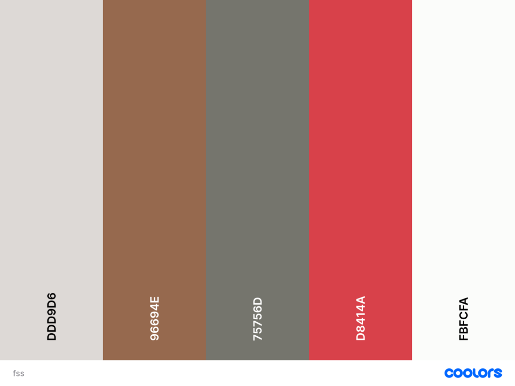
There’s a beautiful tension in a kitchen that balances raspberry red accents with dark warm neutrals.
The wood cabinetry and taupe-gray tiles create a calm, grounded base – rich enough to feel luxurious but neutral enough to welcome a bold color moment.
Then the raspberry steps in, not as a dominant shade but as a vibrant punctuation mark, bringing energy and personality without overwhelming the palette.
It’s one of those Kitchen Color Palette Ideas that proves a little contrast can feel incredibly refined when the undertones align.
If you wanted to expand this scheme, muted terracotta, deep olive, or a warm charcoal would integrate seamlessly, keeping the palette cohesive.
Charcoal gray and mulberry wood
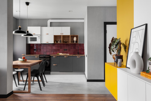
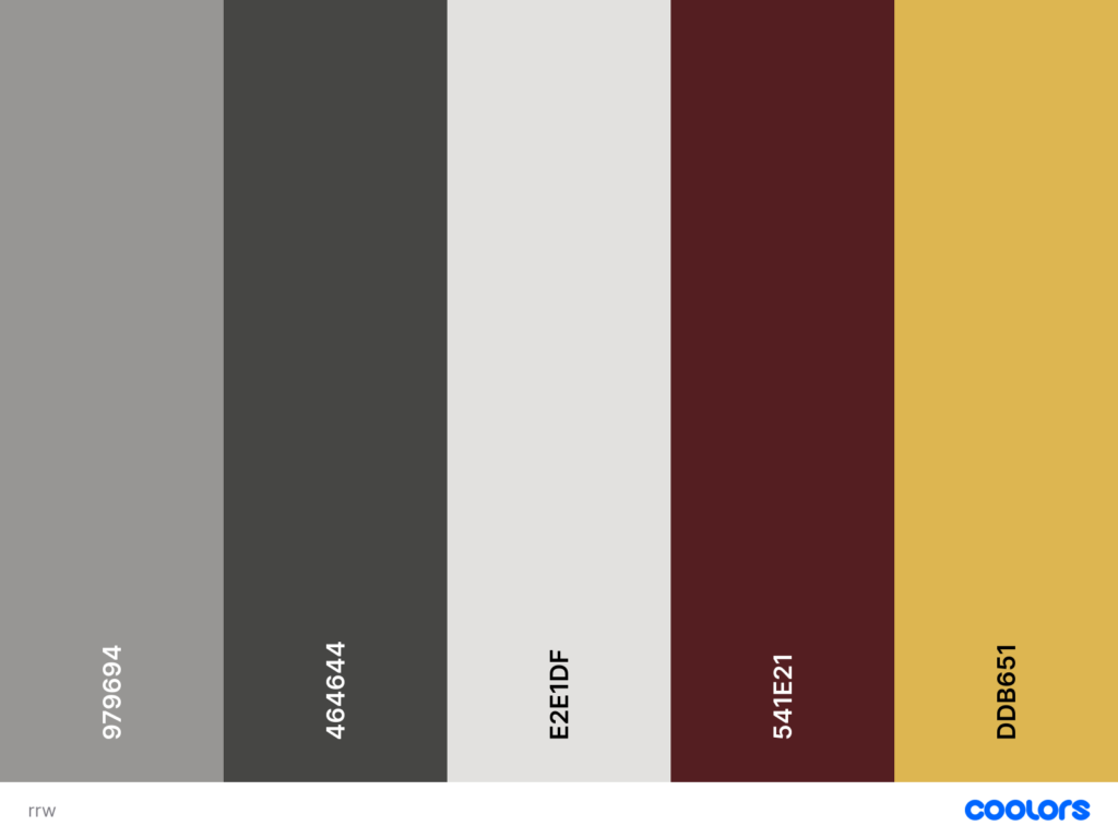
Charcoal gray and mulberry wood create the kind of palette that doesn’t shout for attention, but quietly pulls you in.
It feels grown-up, deliberately moody, and beautifully layered.
The charcoal sets the stage with its calm, matte sophistication, while the mulberry wood color introduces a subtle red warmth that feels almost like a vintage wine – deep, earthy, and incredibly refined.
What makes this kitchen especially compelling is the unexpected dialogue between the reddish backsplash and the mustard accents.
These touches aren’t decorative for the sake of color; they shift the palette from serious to soulful, giving the space emotion and vibrancy.
If you’re thinking about alternatives, muted olive or a warm clay would blend seamlessly into this story.
Chili Red and Pale Light Grayish Turquoise
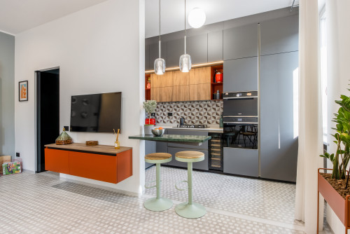
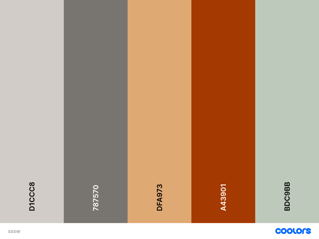
Some kitchens thrive on quiet neutrals, but this one lives in the sweet spot between boldness and serenity. Chili red appears in small but powerful moments – just enough to energize the room without overwhelming it.
Opposite that, the pale light grayish turquoise steps in like a breath of cool air, softening the intensity and giving the whole palette a sense of balance.
Together, they create one of those Popular Kitchen Color Combinations that feels modern, graphic, and quietly playful.
What’s especially beautiful here is how the warm wood and warm-gray cabinetry act as mediators.
They keep the red grounded and give the turquoise somewhere calm to land, which is why the palette reads intentional instead of chaotic.
Shades of yellow and black
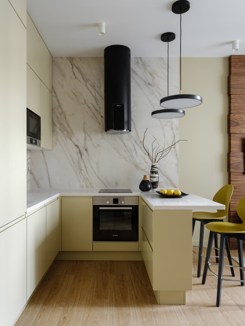
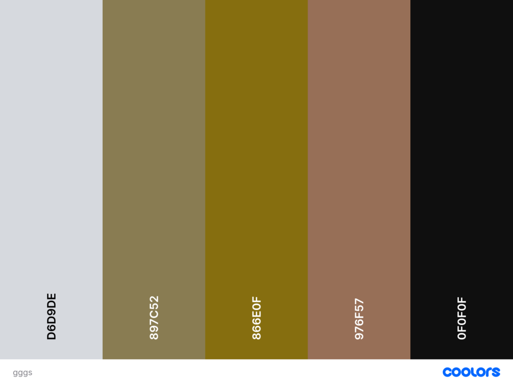
Shades of yellow and black bring a very intentional, architectural sharpness to this kitchen.
Because yellow sits in the warm spectrum and black anchors the cool, the two naturally balance each other – one energises, the other stabilises.
The muted, almost creamy yellow cabinetry softens the palette so it still feels refined and modern, not high-contrast or cartoonish.
Black then appears strategically: in the pendant lights, the bar stools, and the hood—each acting like a punctuation mark in an otherwise calm composition.
Cyan opaque and and light wood
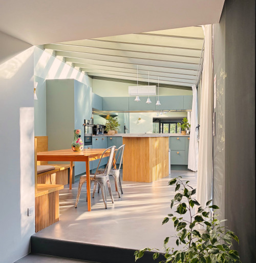
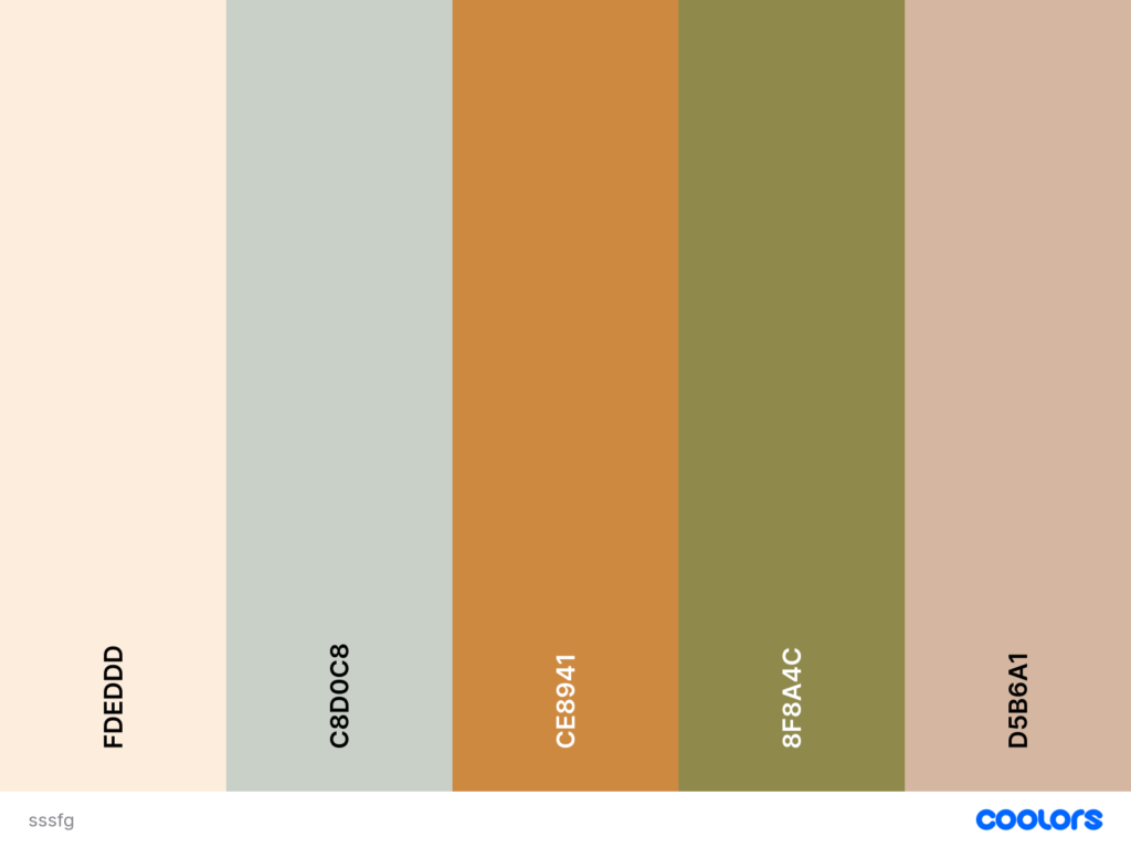
There’s something wonderfully serene about this pairing.
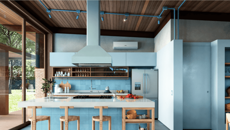
The cyan-opaque cabinetry reads as a cool, milky blue: soft enough to feel calming, saturated enough to feel intentional.
When you anchor it with light wood tones, the whole palette shifts into that sweet spot designers love: gentle contrast, natural warmth, and a sense of airiness that works beautifully in both Small Kitchen Colour Schemes and open-plan spaces.
The addition of sandy peach and muted olive in the broader palette only deepens the craftsmanship feel, giving you plenty of options if you ever want to layer in Kitchen Color Combinations Ideas through textiles or seating.
Pastel Cyan and dark wood
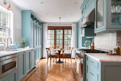
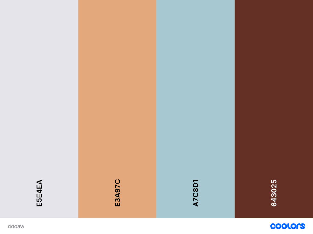
Pastel cyan paired with dark wood creates one of those quietly luxurious Kitchen Colour Palette Ideas that feels both airy and deeply grounded at the same time.
The pastel cyan leans cool and powdery, which instantly softens the room and gives you that fresh, morning-light effect – perfect for anyone craving Kitchen Inspo Color Schemes that aren’t sterile.
Then the dark wood steps in as the anchor: warm, weighty, and sophisticated, adding the richness every Kitchen Remodel needs to avoid looking flat.
Bright spring colors
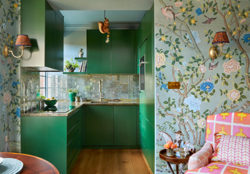
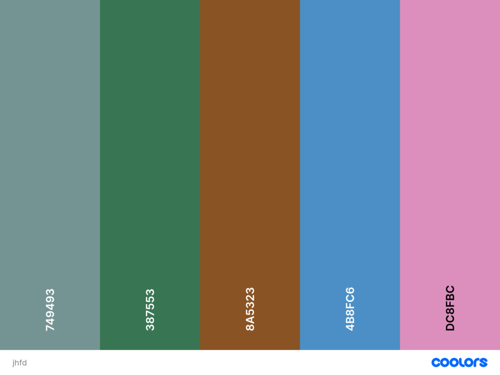
In this kitchen color combination example, the saturated green cabinetry grounds the space, letting the playful wallpaper, powder-blue accents, and soft pinks read as intentional rather than chaotic.
What makes it work is the classic spring triad: green for freshness, floral pink for warmth, and sky blue for lift – a combination that naturally balances itself because each hue sits in gentle opposition on the colour wheel.
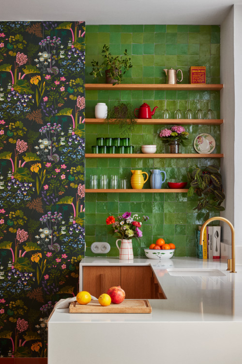
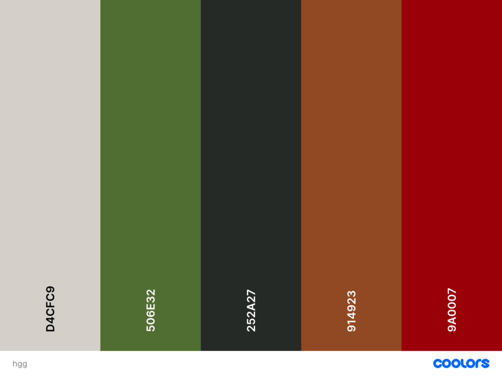
A very green palette
Analogous color palette – green and yellow
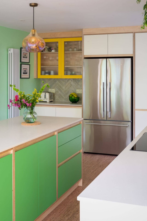
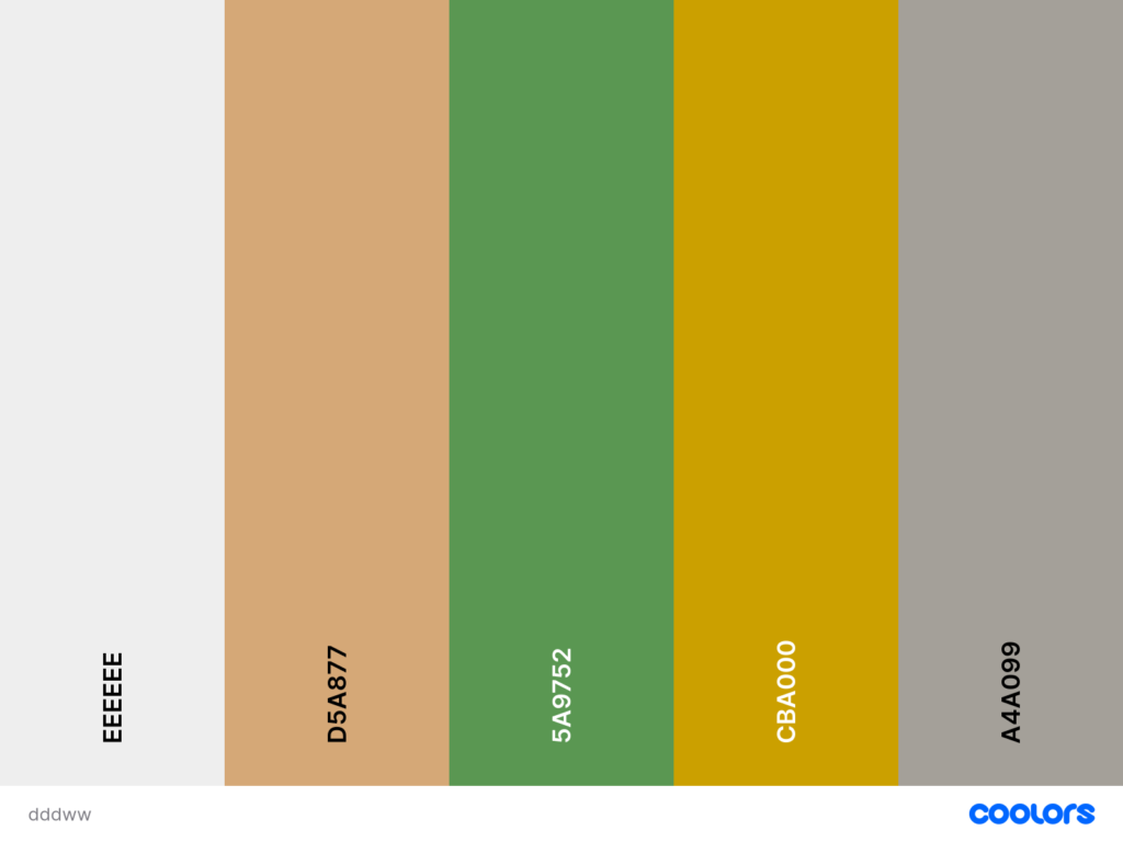
There’s something irresistibly joyful about an analogous palette, especially when it leans into vibrant greens and warm yellows.
This kitchen proves how Kitchen Colour Combination Ideas don’t need to be complicated to feel both modern and characterful – green cabinetry brings the freshness, while the yellow upper units inject just enough sunshine to keep the palette playful.
What makes this pairing work so beautifully is the balance: cool mint walls soften the bold saturation, and the quiet white countertops stop the scheme from tipping into chaos.
If someone wanted a calmer version of this Kitchen Color Palette, swapping the bright lemon for a muted mustard would instantly make the palette feel more Kitchen Colour Schemes Modern.
Red and green complementary
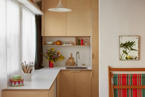
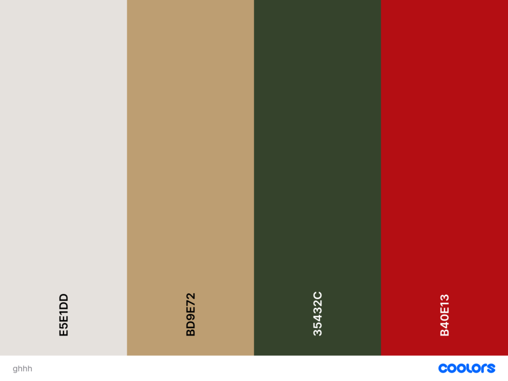
There’s something instantly captivating about a kitchen that leans unapologetically into true complementary contrasts, and this space shows exactly why the red–green pairing is a classic.
The muted sage-green cabinets create a calm, grounded base—soft enough to let the eye relax—while the vibrant red accents cut through with just the right amount of energy.
Because the undertones are warm on both sides (the earthy green, the slightly brown-leaning red), the palette feels intentional rather than festive, which is the key to making complementary Kitchen Colour Combination Ideas feel sophisticated rather than seasonal.
Red and blue – the triad cliché
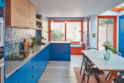
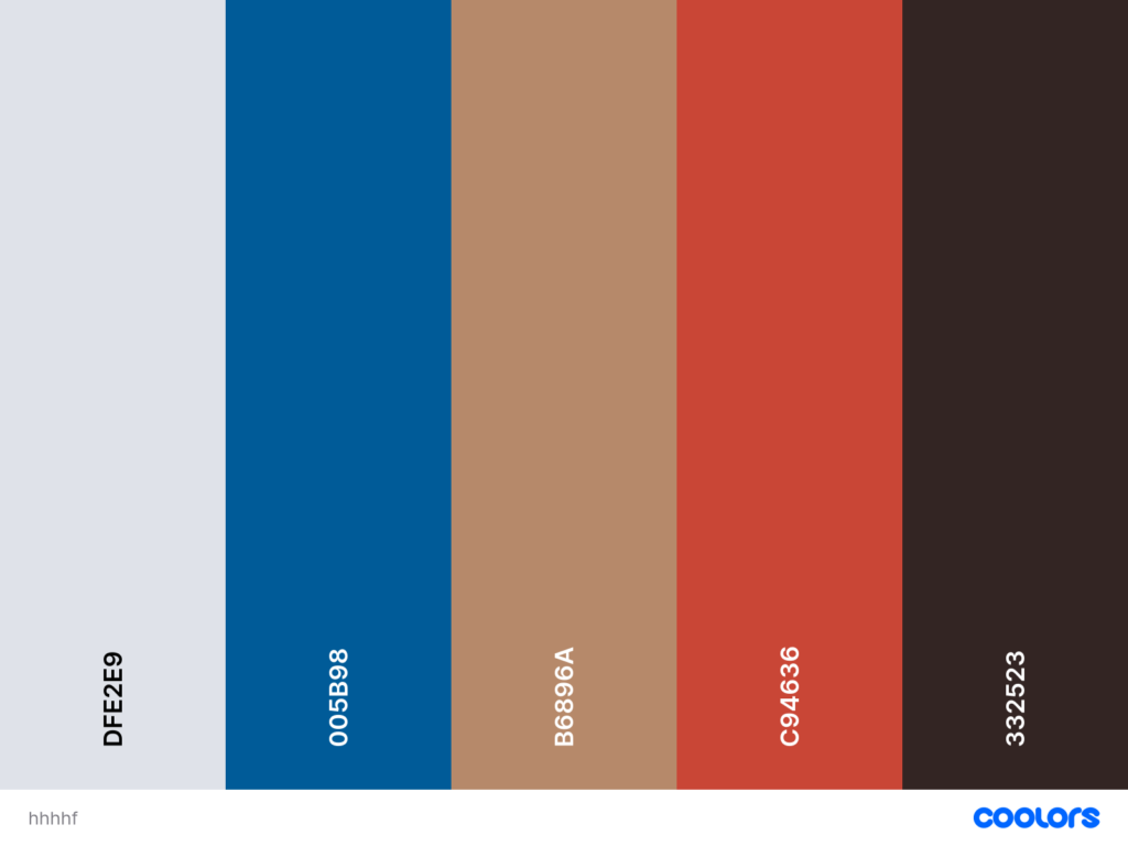
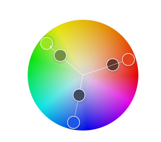
There’s a reason this kitchen feels electrifying rather than chaotic: the designers leaned into a saturated red-and-blue triad but anchored it with warm wood and a quiet gray floor.
The blue cabinetry acts as the visual foundation – steady, cool, and architectural – while the energetic red frames and accents inject just enough tension to make the palette feel intentional rather than cartoonish.
What really saves this combination from cliché is the earthy camel tone woven through the room; it softens the contrast and gives the entire color scheme a grown-up, design-forward elegance.
Conclusion
Choosing the right kitchen color palette is so much more than selecting a few pretty shades – it’s about creating a space that feels intentional, elevated, and perfectly aligned with how you want to live.
Whether you’re drawn to calming neutrals, bold complementary contrasts, or playful triadic combinations, the best kitchen colour schemes respect balance, undertone harmony, and material context.
As you explore these architect-approved palettes, use them as a blueprint for your next Kitchen Remodel or design refresh.
With thoughtful colour pairing, even the smallest kitchens can feel timeless, expensive, and full of personality.
Let these Kitchen Color Palette Ideas guide your decisions, and you’ll end up with a space that looks curated, cohesive, and effortlessly beautiful for years to come.